
HTML and CSS Tutorial in Hindi
Comprehensive HTML and CSS tutorial in Hindi, covering beginner to advanced concepts with hands-on projects. Learn to design responsive websites from scratch using modern web development techniques.
HTML and CSS Tutorial in Hindi for Beginners
Learn to design attractive websites using HTML and CSS, covering basics to advanced topics like responsive design and portfolio creation.
Tailwind CSS - Curso desde cero Español
Aprende a maquetar y diseñar páginas web responsivas con Tailwind CSS, desde los fundamentos hasta animaciones y efectos, sin necesidad de escribir código CSS.
Optimizar Drupal
Aprende técnicas avanzadas para mejorar el rendimiento de Drupal 8, incluyendo optimización de imágenes, diseño responsivo, carga diferida y uso de CDN para una experiencia web más rápida y eficiente.

Blogger
Aprenda a otimizar seu blog no Blogger com dicas de SEO, personalização de tema, aumento de tráfego orgânico e integração com ferramentas do Google.

Magento Tutorial For Beginners In Hindi/Urdu
शुरुआती लोगों के लिए हिंदी/उर्दू में मैग्नेटो का व्यापक परिचय, जिसमें इंस्टॉलेशन, डैशबोर्ड, थीम्स, एक्सटेंशन्स, उत्पाद प्रबंधन और प्रतिक्रियाशील वेबसाइट निर्माण शामिल है।

If Responsive Web Design is the Answer, What Was the Question?
Hinterfragung des Responsive Web Designs: Projektziele, Budget und mobile Anforderungen vor der Technologiewahl berücksichtigen. Einblicke vom WURFL-Entwickler zur effektiven Planung mobiler Webprojekte.

Responsive Images - Current Possibilities and Future Developments
Erfahren Sie, wie responsive Bilder in Webdesign implementiert werden, aktuelle Möglichkeiten und zukünftige Entwicklungen in diesem Bereich.

Web Development Trends: JavaScript, HTML5, Responsive Design, and Tablets
Einblicke in moderne Webtechnologien: JavaScript, HTML5, Responsive Design und Tablet-Optimierung. Opera-Experte Patrick Lauke erläutert aktuelle Trends und Best Practices für zukunftsorientierte Webentwicklung.

Responsive Landing Page Using HTML, CSS, jQuery, and Bootstrap 4 - Complete Website Using Bootstrap 4
Learn to create a responsive landing page using HTML, CSS, jQuery, and Bootstrap 4. Covers design elements like About Us, Our Approach, Blog, Contact, and Footer sections with interactive features and mobile optimization.
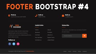
Responsive Footer Bootstrap 4 - Bootstrap 4 Footer Design
Learn to create a responsive footer using Bootstrap 4, including design elements like social icons, useful links, and input fields. Gain practical skills for enhancing website layouts with professional-looking footers.
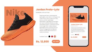
Responsive Product Card UI Design Using HTML CSS jQuery - Responsive E-Commerce Card Design
Learn to create a responsive e-commerce product card UI using HTML, CSS, and jQuery. Master essential web design techniques for building interactive and visually appealing product displays.
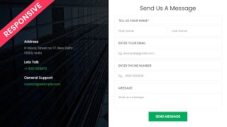
Responsive Contact Us Form HTML - CSS - Contact Us Page Design
Learn to create a responsive contact form using HTML and CSS, with step-by-step guidance on design, layout, and styling for an effective user interface.
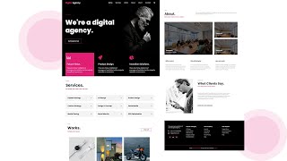
How to Make Complete Responsive Website Using Bootstrap 4 - HTML5 - CSS3 - Bootstrap 4 Website
Learn to build a responsive website using Bootstrap 4, HTML5, and CSS3. Covers header, search box, banner, services, work portfolio, about section, client testimonials, footer, and scroll-to-top functionality.
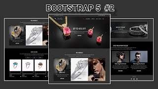
Responsive E-Commerce Shopping Website Using Bootstrap 5 - Bootstrap 5 Responsive Website Design
Learn to build a responsive e-commerce website using Bootstrap 5. Create product cards, deal sections, blog posts, and a footer. Enhance your web design skills with practical, hands-on experience.

Responsive ECommerce Website Using Bootstrap 5
Learn to create a responsive e-commerce website using Bootstrap 5. Master navbar design, carousel sliders, and JavaScript functionality for a professional online store.
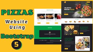
Responsive Food and Restaurant Website Using Bootstrap 5 - Bootstrap 5 Responsive Website Design
Learn to create a responsive food and restaurant website using Bootstrap 5. Covers key sections like About Us, Food Categories, Carousel Slider, and Footer with HTML, CSS, and JavaScript implementation.

Bootstrap Tutorial in Hindi - Bootstrap 5 Float & Clearfix Classes
Aprenda a usar classes de float e clearfix no Bootstrap 5, incluindo exemplos práticos de largura, altura e viewport para criar layouts responsivos eficientes.
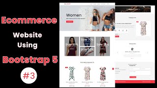
Responsive E-Commerce Website Using Bootstrap 5
Learn to build a responsive e-commerce website with Bootstrap 5, including countdown timers, testimonial sliders, contact forms, and animated scroll effects.
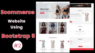
Responsive E-Commerce Website Using Bootstrap 5
Learn to create a responsive e-commerce website using Bootstrap 5, covering online store sections, product cards, and banners with HTML and CSS in this Hindi tutorial.
Bootstrap Display Classes Tutorial in Hindi
Bootstrap 5 डिस्प्ले क्लासेस का हिंदी में व्यापक ट्यूटोरियल। सीखें कैसे विभिन्न स्क्रीन साइज़ों और प्रिंट मीडिया के लिए कंटेंट को प्रदर्शित या छिपाया जा सकता है।