Web Development Projects
Learn to build responsive websites and interactive games using HTML, CSS, JavaScript, Bootstrap, and jQuery through hands-on projects like e-commerce sites and a Ping Pong game.
Web App Development Using Flutter & Firebase - Website Design & Website Development Course for Beginners
Learn to build responsive web apps using Flutter and Firebase, covering UI design, authentication, and real-time features. Includes a FoodPanda clone project for practical application.

Flutter Web Tutorial - Flutter for Web Step by Step - Flutter Web App Tutorials - Flutter for Web Developers - Flutter Tutorial for Beginners
Learn to develop responsive web applications using Flutter, from installation to creating sign-up forms and landing pages.

CSS Layout
Master responsive web design using CSS Grid and Flexbox through hands-on, uncut tutorials. Learn to create dynamic layouts like carousels, dashboards, and scrolling lists.
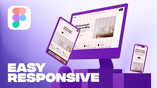
Responsive Website in Figma
Learn to create responsive layouts in Figma using columns for different breakpoints. Master layout grids, understand responsive design principles, and apply them to convert desktop designs to tablet and mobile.
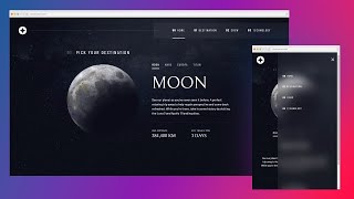
Responsive Navbar Tutorial Using HTML, CSS & JS
Learn to create a responsive navbar using HTML, CSS, and JavaScript, covering mobile and desktop layouts, styling, animations, and browser compatibility.

Responsive Design Made Easy
Learn to create responsive layouts easily with custom properties, basic styling, and layout techniques for a pain-free approach to building adaptable websites.
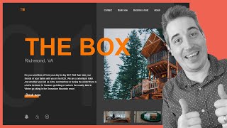
Creating a Responsive, Asymmetrical Design with HTML & CSS
Learn to create responsive, asymmetrical designs using modern CSS tools like grid, subgrid, flexbox, and clamp(). Master mobile-first approach and adapt layouts for larger screens.
Coding a Responsive Webpage From Start to Finish
Learn to build a responsive webpage from scratch using HTML and CSS, covering mobile and desktop layouts, typography, navigation, and various sections like hero, products, and footer.

Create a Responsive Navigation Nav With No JS
Learn to create a responsive navigation menu using modern CSS techniques, including flexbox, grid, and pseudo-elements, without relying on JavaScript for functionality.

Responsive Navigation With an Animated Dropdown Using CSS Clip-Path
Learn to create a responsive navigation menu with an animated dropdown using CSS clip-path, jQuery, and custom hamburger menu animation for enhanced user experience.

Bootstrap 5 Crash Course
Comprehensive guide to Bootstrap 5, covering grid system, components, and utility classes. Learn to create responsive layouts and stylish interfaces efficiently.

Position Absolute and Responsive Layouts
Learn to create responsive layouts using position absolute, from basic setup to advanced techniques for larger layout pieces.

Build and Deploy 4 Modern React Apps and Get Hired as a Frontend Developer
Learn to build and deploy 4 modern React apps, mastering UI/UX design, responsive layouts, animations, and deployment. Gain practical skills to become a sought-after frontend developer.
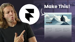
Framer Crash Course - From UI-UX to Frontend with No Code
Learn to create responsive landing pages with Framer, from UI/UX design to frontend development without coding. Master layout, animations, and deployment in this comprehensive tutorial.
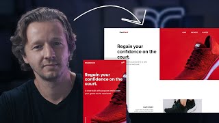
Learn HTML & CSS - Crash Course
Comprehensive HTML & CSS crash course covering responsive design, mobile-first approach, animations, and JavaScript integration for a fully functional website.
Getting Started with Bootstrap 5 for Beginners - Crash Course
Learn to create responsive websites with Bootstrap 5 in this beginner-friendly tutorial. Covers installation, component customization, and building a sample site from scratch.

HTML and CSS Tutorial for 2021 - Complete Crash Course
Comprehensive HTML and CSS tutorial covering responsive design, from basic structure to advanced styling. Includes hands-on project and mobile navigation implementation.

Build a Responsive HTML & CSS Template with FlexboxGrid
Create a responsive HTML & CSS template using FlexboxGrid, a lightweight Flexbox-based grid system. Learn to build a modern website layout with easy alignment and Bootstrap-like classes.

Build a Responsive, Mobile First Website - HTML5 & CSS3
Learn to create a responsive, mobile-first photography website using HTML5 and CSS3. Develop skills in modern web design techniques, including smooth scrolling and hover effects.
Bootstrap Tutorial for Beginners in Hindi - Urdu
व्यापक बूटस्ट्रैप 4 ट्यूटोरियल जो आपको रिस्पॉन्सिव वेबसाइट बनाने के लिए आवश्यक सभी कौशल सिखाता है। ग्रिड सिस्टम, कंपोनेंट्स और प्लगइन्स शामिल हैं।