
Bootstrap 5 Tutorial
Learn how to create a responsive landing page with Bootstrap - using features & component new to Bootstrap 5 (accordion and offcanvas), in this Bootstrap 5 crash course tutorial series.
Bootstrap 4 Tutorials
In this tutorial, you will learn about Bootstrap 4. You will learn about installing Bootstrap 4, Bootstrap reboot, containers, grid basics, flex grid, jumbotrons, utilities and typography, cards, Bootstrap navs, responsive navbars, and tooltips.
CSS Grid Tutorial
In this tutorial, you will learn about CSS Grid. You will learn about the use of CSS Grid, columns, rows, grid lines, nested grids, aligning and justifying items, creating a 12-column grid, mosaic layout, grid areas, and responsive grid examples.
Responsive Web Design Tutorials
Learn essential responsive development skills to create mobile-friendly websites, covering viewports, media queries, fluid layouts, drop-down menus, and responsive images.
CSS Grid
Master CSS Grid: from fundamentals to advanced techniques. Learn sizing, placement, responsive design, and practical exercises for creating flexible, powerful layouts.
PSD to Responsive Website Tutorial
Learn to transform PSD designs into fully responsive websites, covering Photoshop slicing, HTML structure, CSS styling, and mobile optimization techniques.

Mobile-First Responsive Build with CSS Grid
In this mini-series, we'll build a responsive website using a mobile-first approach (developing the site for mobiles first and then extending the design to larger screens).
Bootstrap 4 Responsive Website Development for Beginners
Learn to create a responsive portfolio website using HTML5, CSS3, JS, jQuery, and Bootstrap 4. Develop a tech company site with services like web development and SEO, and understand responsive design principles.

Responsive Web Design
Learn to create flexible, adaptive websites that look great on any device. Master key techniques like fluid layouts, responsive text, and media queries.
HTML & CSS Live Coding
Learn to build responsive landing pages and product pages through live coding sessions, mastering HTML and CSS techniques for creating professional web designs.
Building a Footer Using CSS Grid - Build a Responsive Website from Scratch
Learn to build a responsive footer using CSS Grid, including mobile and desktop styles, grid template areas, and hover states for a polished website design.
Responsive 4-Column Layout with CSS Grid - Build a Responsive Website from Scratch
Learn to create a responsive 4-column layout using CSS Grid for a blog articles section. Explore HTML markup, SCSS styling, and responsive design techniques to build an attractive and functional webpage component.
Responsive 4-Column Layout with Flexbox - Build a Responsive Website from Scratch
Learn to create a responsive 4-column layout using flexbox for a website's Features section. Master HTML, CSS (SCSS), and flexbox techniques to build adaptable, visually appealing web designs.
Animated Hamburger Menu in CSS-JS - Build a Responsive Website from Scratch
Learn to create an animated hamburger menu and responsive overlay using HTML, CSS (SCSS), and vanilla JavaScript. Follow along with troubleshooting and problem-solving techniques for web development.
Build a Responsive Website From Scratch With HTML & CSS - Navigation Bar
Learn to create a responsive website's navigation bar using HTML & CSS, covering setup, styling, and advanced techniques like Sass variables and mixins for breakpoints.

Tailwind Crash Course - Project From Scratch
Learn to build a responsive landing page using Tailwind CSS, covering setup, utility classes, custom CSS, and deployment to InMotion Hosting with Git.
Bootstrap V5 - Getting Started - Buttons, Responsive Columns, Accordion
Learn Bootstrap v5 essentials: buttons, responsive columns, and accordions. Explore basic classes, responsive design, and JavaScript components in this concise tutorial for web developers.
CSS Layout - Flexbox & Grid Basics
Learn CSS layout techniques with Flexbox and Grid, covering responsive design, background colors, and content width for modern web development.

Total WordPress Theme
Learn to build a professional website using the Total WordPress theme, covering installation, customization, and advanced features for creating stunning, responsive designs.
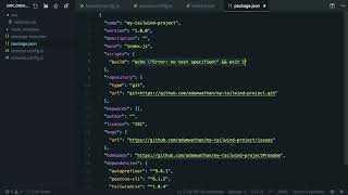
Designing with Tailwind CSS
Learn to create responsive, customizable designs efficiently using Tailwind CSS's utility-first approach, from basic setup to advanced component extraction and optimization.

Quick Tailwind Grids
Learn to create responsive grid systems using Tailwind's utility classes, from basic layouts to advanced techniques like nested grids and auto-generation.