Bootstrap 5 Flex Direction Classes Tutorial in Hindi
Aprende las clases de dirección flex de Bootstrap 5 en hindi, incluyendo row, column, wrap y fill. Tutorial práctico con ejemplos en vivo.
Bootstrap Tutorial in Hindi - Bootstrap 5 Margin Classes
हिंदी में Bootstrap 5 मार्जिन क्लासेस का व्यापक ट्यूटोरियल। विभिन्न साइड क्लासेस, नेगेटिव मार्जिन और ब्रेकपॉइंट्स के उदाहरणों सहित मार्जिन का उपयोग सीखें।
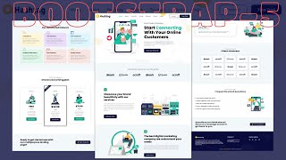
Responsive Digital Marketing Agency Website Using Bootstrap 5
Learn to build a responsive digital marketing agency website using Bootstrap 5, covering testimonials, clients, FAQs, and footer sections with HTML, CSS, and media queries.
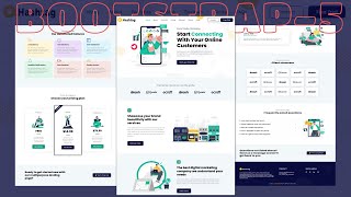
Responsive Digital Marketing Agency Website Using Bootstrap 5
Learn to create a responsive digital marketing agency website using Bootstrap 5, including navbar, hero section, and client carousel. Gain practical skills in HTML, CSS, and JavaScript.
Bootstrap 5 Scrollspy Tutorial in Hindi
हिंदी में Bootstrap 5 Scrollspy का व्यापक ट्यूटोरियल। नेस्टेड नेव और लिस्ट ग्रुप के साथ उदाहरण शामिल हैं। कस्टम नेविगेशन का भी प्रदर्शन किया गया है।

Creating a Fully Responsive Website Using HTML and CSS - Tutorial 39
Comprehensive tutorial on building a responsive website using HTML and CSS, covering essential techniques for creating adaptable layouts and designs for various screen sizes.

Create a Responsive Website Using HTML, CSS and Bootstrap 4 - Hindi Tutorial
एक प्रतिक्रियाशील वेबसाइट बनाने की व्यावहारिक गाइड, जो HTML, CSS और Bootstrap 4 का उपयोग करके हिंदी में सिखाती है। नवीनतम वेब डिज़ाइन तकनीकों को सीखें और अपने कौशल को बढ़ाएं।
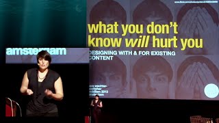
Designing with and for Existing Content - Responsive Design Strategies
Strategies for analyzing and structuring legacy content to enhance mobile design, focusing on patterns, relationships, and meaningful organization for better, longer-lasting products.

Convert Adobe XD to Responsive HTML and CSS Website
Learn to transform Adobe XD designs into responsive HTML and CSS websites, with practical implementation of UI/UX concepts, animations, and WordPress integration for a complete web development experience.
Starting the CSS for Our Page - Typography Foundations
Learn to prioritize typography in web design, ensuring content readability before tackling layout. This approach streamlines the design process and prevents unnecessary layout adjustments.

Designing a Responsive Website in Figma - From Desktop to Mobile
Learn to create a responsive website design in Figma, covering desktop, tablet, and mobile versions with scrolling animations. Perfect for web designers looking to enhance their skills.
Web Design for Beginners
Learn web design fundamentals and create a portfolio website. Master color theory, typography, spacing, and responsive design while building common web elements like headers, galleries, and forms.
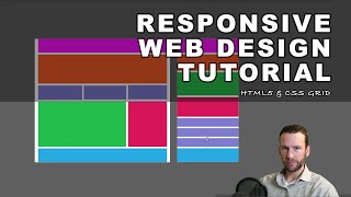
Responsive Web Design Tutorial
Create a responsive web design using CSS grid and media queries, covering HTML5 and CSS from scratch without frameworks. Learn wireframing, layout techniques, and mobile optimization.

The Ultimate CSS3 Flexbox Tutorial - Colt's Code Camp
Master CSS3 Flexbox: Learn properties, terminology, and practical applications. Gain hands-on experience through exercises and examples to create flexible, responsive layouts effortlessly.

How to Create a Responsive Website Using HTML and CSS - Learn HTML and CSS - Full Course
Learn to create a responsive website using HTML and CSS. This comprehensive tutorial covers front-page design, mobile and desktop responsiveness, and essential web development techniques.
How to Create a Bootstrap 3 Menu - Learn Bootstrap Front-End Programming
Create a responsive Bootstrap 3 navigation menu with dropdown, search, and social media integration for desktop and mobile devices.

Make a Website Responsive for All Devices - Learn HTML and CSS Full Course for Beginners
Learn to create responsive websites using media queries in CSS, adapting layouts for various devices and screen sizes to ensure optimal viewing experiences across platforms.
CSS Flexbox Tutorial for Beginners - Learn HTML and CSS Full Course for Beginners
Comprehensive guide to CSS Flexbox, covering container properties and item styling. Learn to create flexible layouts, align elements, and control spacing for responsive web design.
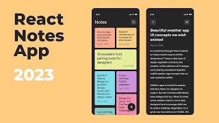
React Notes App Tutorial for Beginners 2023 - React JS Beginner Project Tutorials
Learn to build a modern, responsive React notes app from scratch, covering essential concepts like routing, state management, and local storage.
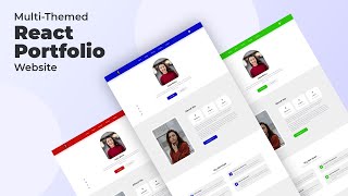
React Portfolio Website Tutorial From Scratch - Responsive React JS Portfolio Website
Learn to build a responsive React portfolio website with theme customization, animations, and advanced features. Master modern React, CSS best practices, and essential web development skills.
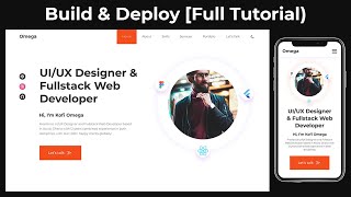
Complete Responsive Personal Portfolio Website Using HTML, CSS & JavaScript - Full Tutorial
Learn to create a responsive personal portfolio website using HTML, CSS, and JavaScript. Covers design, functionality, and deployment with modern techniques like Flexbox and Grid.