A Practical Guide to Responsive Web Design
Learn practical tips for creating responsive web designs, including avoiding fixed sizes, leveraging browser capabilities, and using media queries effectively.

Mediaqueryless Responsiveness - Creating Flexible Layouts Without Media Queries
Explore flexible, responsive layouts without media queries using CSS tools like floats, columns, flexbox, and viewport units for efficient web design.
Scale and Adapt - Building Responsive BBC News
Explore BBC News' journey in building a responsive, high-performance website that adapts to diverse devices, focusing on scalability, browser support, and innovative development techniques.
Enhancing Responsiveness with Flexbox
Enhancing responsive layouts with flexbox: control order, alignment, and proportional sizes while letting the browser handle complex calculations for optimal space utilization.
Responsive Principles - Adapting Web Design for Connected Devices
Explore principles for adaptive web design beyond responsiveness, focusing on creating flexible products for diverse connected devices in an evolving digital landscape.
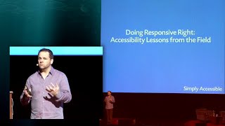
Doing Responsive Right: Accessibility Lessons for Mobile Design
Exploring responsive design's impact on accessibility, offering practical insights and guiding principles for creating inclusive web experiences that work for all users, including those with disabilities.

Flexbox Froggy Game in HTML + CSS
Learn to master CSS Flexbox through an interactive game, building a fun froggy-themed layout while gaining practical skills in responsive web design.
Build and Deploy a Fully Responsive Next.js 13 App Faster with an AI Tool
Learn to rapidly build responsive Next.js 13 apps using AI-powered Locofy, transforming designs into functional code. Explore seamless design-to-code conversion and efficient development techniques.
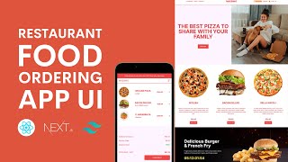
Restaurant Food Delivery App Design - React Next.js and Tailwind
Learn to design a responsive restaurant food delivery website using React, Next.js, and Tailwind CSS. Create UI components like sliders, menus, and product pages while mastering modern web development techniques.
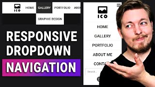
Responsive Dropdown Navigation for Beginners with HTML & CSS - Responsive Web Design Tutorial
Aprenda a criar um menu de navegação responsivo com dropdown usando HTML e CSS, incluindo técnicas para design web adaptável e compatibilidade com dispositivos móveis.

How to Create a Responsive HTML Table
Learn techniques for creating responsive HTML tables, including CSS styling, container usage, and accessibility improvements for various screen sizes.
Responsive Working of Bootstrap Grid System - Part 2
Explore Bootstrap's responsive grid system, focusing on device-specific column classes and layout control for optimal mobile-friendly design across various screen sizes.
Understanding the Bootstrap Grid System - Part 1
Learn Bootstrap's grid system for responsive web design, including media queries, breakpoints, and container-row-column structure for effective mobile-first layouts.
Build a Landing Page Using Bootstrap 5 - Full Step by Step Tutorial
Step-by-step guide to creating a responsive landing page using Bootstrap 5 and CSS. Learn to build professional-looking websites for various businesses with modern design elements.
Bootstrap 5 Tutorial - Crash Course for Beginners
Comprehensive guide to Bootstrap 5, covering key components and features. Learn responsive design, grid system, UI elements, and more in this beginner-friendly tutorial.
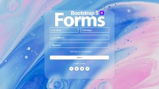
Forms in Bootstrap 5 - Learn Basics and Discover Hidden Options
Learn to create responsive forms in Bootstrap 5, from basic usage to advanced features. Discover hidden options, explore form templates, and master various input types and form elements.
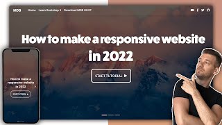
How to Make Responsive Website Using HTML, CSS, and Bootstrap - Code & Deploy
Learn to create and deploy a responsive website using HTML, CSS, and Bootstrap. Master modern web development techniques, including navigation, sliders, flexbox, grid, and more.
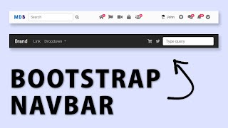
Bootstrap Navbar - Tutorial on the Latest Bootstrap 5
Learn to create and customize Bootstrap 5 navbars, including responsive design, color options, and advanced techniques. Discover useful tools like the Navbar Generator for efficient development.
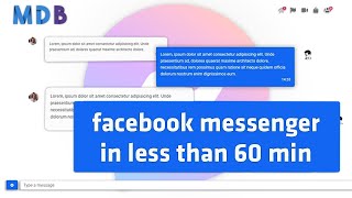
Facebook Messenger with Bootstrap 5 - Tutorial
Learn to build a Facebook Messenger-like app using Bootstrap 5 and MDB 5. This tutorial covers UI components, responsive design, and customization techniques for creating a modern messaging interface.

Portfolio with Bootstrap 5 & Material Design 2.0 - MDB 5 Tutorial
Build an impressive portfolio using Bootstrap 5 and Material Design 2.0. Learn to create a responsive, visually appealing resume showcasing your skills and projects to potential employers.
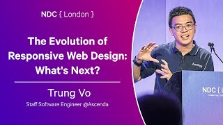
The Evolution of Responsive Web Design: What's Next?
Explore modern CSS techniques for responsive design, including container queries, style queries, and fluid sizing. Learn to create adaptable websites without heavy reliance on media queries.