React Portfolio Website - Build and Deploy - Responsive Portfolio Website Tutorial for Beginners
Build a responsive React portfolio website with creative CSS animations, dark mode, and email integration. Learn installation, component creation, and deployment.
Responsive React Website Using Styled Components
Build a responsive React website using styled components, covering navbar, product intro, features, services, pricing, and contact pages with CSS animations and responsive design.
Responsive React Portfolio Website Tutorial
Comprehensive tutorial on building a responsive React portfolio website, covering components, hooks, animations, and design techniques for beginners.
Bulma CSS Tutorial - Intro to Bulma CSS with Zaydek Gualtieri - Full Course
Learn to build responsive websites with Bulma CSS framework. Master heroes, columns, colors, media, grids, headers, images, content, backgrounds, and navbars through hands-on practice creating three beautiful sites.
Create Borders With Cut Corners - Fully Responsive CSS and Easy to Adapt
Learn to create responsive buttons with cut corners using CSS custom properties, clip-path, and pseudo-classes. Master advanced styling techniques for unique and adaptable designs.

Flexbox Is More Complicated Than You Thought
Dive deep into Flexbox's complexities, exploring element sizing, shrinking, growing, and common misconceptions. Learn practical solutions and compare Flexbox with Grid.
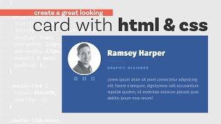
Build a Responsive Card - HTML and CSS Tutorial
Learn to create a fully responsive card using HTML, CSS, and flexbox, mastering essential web design techniques for adaptable layouts.
Coding a Signup Form With HTML and CSS
Learn to create a responsive email signup form using HTML and CSS, with a focus on flexbox for layout and styling techniques to enhance visual appeal.

Simple Tips to Making Responsive Layouts the Easy Way
Learn five easy techniques for creating responsive layouts, including global styling, flexible sizing, media queries, and modern CSS features to enhance your web design skills.
Responsive Web Design Tutorial - Creating Optimized Sites for Multiple Devices
Learn to create websites that adapt seamlessly to any device. Master techniques for optimizing layouts, images, and content for various screen sizes, ensuring a consistent user experience across platforms.
This is Bootstrap 5
Learn Bootstrap 5's new features, installation, grid system, components, and utilities. Perfect for beginners and experienced developers looking to build responsive, mobile-first websites efficiently.
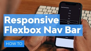
How to Build a Responsive Navigation Bar with Flexbox
Learn to create a mobile-first, responsive navigation bar using flexbox. Practice building layouts for different screen sizes and implement toggle functionality for an interactive user experience.
A "Broken Layout" to HTML & CSS - Full Process
Learn to create a responsive "broken layout" design using HTML and CSS, from concept to implementation, with a focus on mobile-first approach and modern web design trends.

The Frontend Developer Crash Course for Absolute Beginners
Learn to build a responsive website using HTML, CSS, and JavaScript. Covers UI design, semantic HTML, form elements, and styling with CSS. Ideal for beginners wanting hands-on frontend development experience.

CSS Grid Responsive Image Gallery Tutorial
Learn to create a responsive image gallery using CSS Grid, with animations and mobile optimization. Gain practical skills in modern web design techniques.
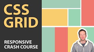
CSS Grid Tutorial - Responsive Crash Course
Master CSS Grid for responsive web design: layout techniques, properties, and the fr unit. Build flexible layouts easily with this modern spec.

Creating Flexibility Models with CSS Grid
Learn advanced CSS Grid techniques to create flexible layouts, including content sizing, FR units, and MinMax for responsive designs.
Webflow Responsive Design for Total Beginners
Learn to create responsive websites using Webflow's tools without coding. Master breakpoints, preview modes, and grid systems to ensure your site looks great on any device.
Smart Sizing in CSS With Container Query Units
Learn to size elements based on parent dimensions using CSS container query units, enhancing responsive design capabilities with practical examples and resources.

Introduction to CSS Container Queries
Learn to use CSS container queries for responsive design, solving media query limitations. Create elements that adapt based on parent size, with practical CodePen demos included.
Responsive Layout Practice for Beginners - Creating a Four Card Feature Section
Learn responsive layout techniques through a hands-on project, covering HTML structure, CSS styling, custom properties, and mobile optimization for a feature section design.