
Tailwind CSS Config and Deploy Tutorial
Learn to configure Tailwind CSS, adjust media queries, extend themes, and deploy your project to GitHub and Render.com in this comprehensive tutorial.
Animated Hamburger Icon, Mobile Menu & Responsive Navbar with Tailwind CSS
Learn to create an animated hamburger icon and responsive mobile menu using Tailwind CSS, enhancing your web design skills with practical, interactive UI elements.
Tailwind CSS Project - TailwindCSS Tutorial
Learn advanced Tailwind CSS techniques to build a responsive website, including custom media queries, pseudo-elements, and various CSS styles for testimonials, contact forms, and footers.
Build a Website with Tailwind CSS - Project Tutorial
Learn to build a responsive website using Tailwind CSS, covering media queries, light/dark mode, and various CSS styles through class names. Hands-on project tutorial for practical implementation.

Tailwind CSS Introduction, Basics & Guided Tutorial
Learn Tailwind CSS basics, setup, and create a project in this guided tutorial. Covers configuration, compilation, tools, and practical examples for efficient styling.

CSS Full Course for Beginners - Complete All-in-One Tutorial
Comprehensive CSS3 tutorial covering selectors, layout, styling, animations, and more. Ideal for beginners looking to master modern web design techniques through hands-on projects and in-depth instruction.

CSS Complete Project for Beginners
Comprehensive tutorial on modern CSS and responsive web design, covering HTML structure, styling, layout techniques, and advanced features like dark mode for a taco shop website.
How to Organize CSS - Beginners BEM Tutorial
Learn effective CSS organization techniques and the BEM naming convention to improve code structure, maintainability, and specificity management in your web development projects.
CSS Animated Responsive Navbar - CSS Animations for Beginners
Learn to create an animated responsive navbar using CSS transforms, transitions, and animations. Covers pseudo-selectors, menu icon design, and dropdown functionality.
CSS Functions Tutorial for Beginners - Min, Max, Clamp, Minmax, Calc, Attr
Comprehensive tutorial on CSS functions including min, max, clamp, calc, attr, and more. Covers practical applications and examples for responsive design and advanced styling techniques.
Make a React Website with Tailwind CSS Tutorial
Step-by-step guide to building a React website with Tailwind CSS, covering setup, component creation, and styling for a complete web application.
Build a Website with Tailwind CSS Tutorial
Hands-on tutorial for building a responsive website using Tailwind CSS, covering setup, navbar creation, hero section design, and JavaScript integration.

Build a Responsive Website Using HTML & SASS-SCSS Tutorial
Create a responsive website homepage using HTML and SASS/SCSS. Learn to structure content, style with SASS, and implement a navbar and hero section for an attractive, mobile-friendly design.
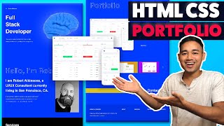
Responsive HTML CSS Portfolio Website Using Flexbox and Grid
Build a responsive portfolio website using HTML, CSS Flexbox, and Grid. Learn to create and style hero, about, services, portfolio, contact, and footer sections for a professional online presence.

HTML CSS Javascript Website Tutorial - Responsive Beginner JS Project with Smooth Scroll
Build a responsive website with HTML, CSS, and JavaScript, featuring smooth scroll and dynamic navbar. Learn step-by-step from setup to advanced features in this comprehensive tutorial.

HTML, CSS, and Javascript Website Design Tutorial - Beginner Project Fully Responsive
Step-by-step tutorial for building a responsive website using HTML, CSS, and JavaScript. Covers navbar, hero section, services, footer, and navigation between pages.

CSS Navbar Dropdown Mega Menu Tutorial
Create a CSS Navbar dropdown mega menu using HTML and CSS. Learn to design an interactive navigation panel with multiple sections, icons, and hover effects for an enhanced user experience.
CSS Custom Variables and Dark Mode - CSS Tutorial for Beginners
Learn to create custom CSS variables and implement a dark mode for web pages, enhancing design flexibility and user experience with practical examples and step-by-step guidance.
CSS Pseudo-Classes vs Pseudo-Elements - Pseudo-Selectors Tutorial
Explore CSS pseudo-classes and pseudo-elements with practical examples. Learn to enhance web designs using selectors like :active, :target, ::before, and ::after for more dynamic and interactive styles.
CSS Responsive Card Design - Mini-Project Tutorial for Beginners
Learn to create a responsive card design using CSS, covering HTML structure, styling, media queries, and breakpoints for various screen sizes.
CSS Media Queries and Responsive Web Design Tutorial for Beginners
Learn CSS media queries and responsive web design techniques to create adaptable layouts for different screen sizes. Covers syntax, breakpoints, mobile-first approach, and practical implementation using dev tools.