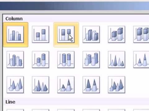
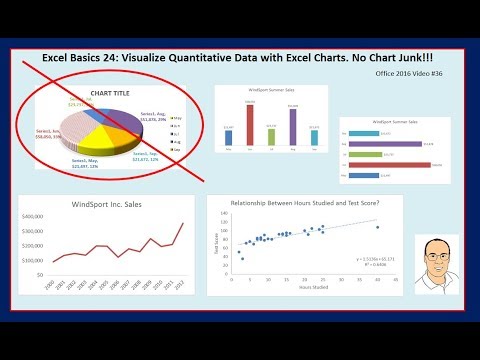
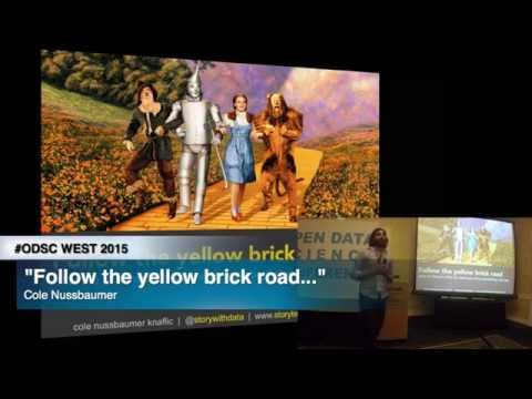
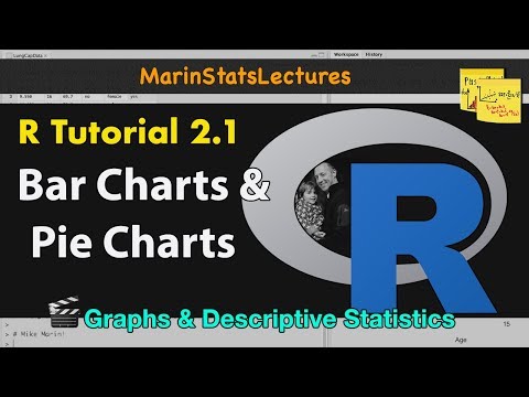
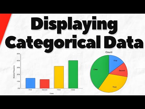
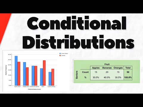
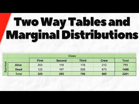
Главная
Study mode:
on
You
History
Saved
In progress
0 courses
compleat
0 courses
#Art & Design
#Adobe
#ChatGPT
#GitHub
#Bar Charts
Showing:
28
courses
Sort by Relevancy
Highest rated
Lowest rated
Most recently added
Data Visualization in Python with Plotly
1
rewiews
Learn to create interactive data visualizations using Plotly in Python, including scatter, bar, line, bubble, histogram, and box plots, with customization techniques for effective data presentation.
Add to list
20
Lesons
1 hour 30 minutes
On-Demand
Free-Video
Python Seaborn Complete Tutorial for Beginners
0
rewiews
Master data visualization with Python's Seaborn library. Learn to create scatter plots, line charts, box plots, and more through step-by-step tutorials and practical examples.
Add to list
11
Lesons
3 hours 30 minutes
On-Demand
Free-Video
Data Visualization Using Plotly for Python
0
rewiews
Learn to create interactive and visually appealing data visualizations using Plotly for Python, covering various chart types and techniques for effective data representation.
Add to list
10
Lesons
1 hour 30 minutes
On-Demand
Free-Video
Tableau Tutorial
0
rewiews
Learn Tableau's key features, architecture, and data visualization techniques including charts, plots, and KPIs for effective business intelligence analysis.
Add to list
12
Lesons
1 hour 30 minutes
On-Demand
Free-Video
Data Viz Using Plotly for R
0
rewiews
Learn to create interactive data visualizations with Plotly in R, covering various chart types and customization techniques for effective data presentation.
Add to list
8
Lesons
3 hours 30 minutes
On-Demand
Free-Video
GCSE Maths Revision - Statistics and Probability
0
rewiews
Comprehensive statistics and probability revision covering key topics for GCSE exams, including averages, probability trees, charts, and data representation methods.
Add to list
12
Lesons
7 hours
On-Demand
Free-Video
Derek Banas
Matplotlib Tutorial
0
rewiews
Comprehensive tutorial on Matplotlib, covering various plot types, customization options, and integration with Pandas. Ideal for data visualization in Python.
Add to list
19
Lesons
1 hour 34 minutes
On-Demand
Free-Video
Dr Trefor Bazett
How I Make Beautiful Graphs and Plots Using LaTeX
0
rewiews
Learn to create professional-quality graphs and plots using LaTeX and pgfplots, covering 2D and 3D visualizations, customization techniques, and data importing for enhanced scientific and mathematical presentations.
Add to list
15
Lesons
29 minutes
On-Demand
Free-Video
ExcelIsFun
Excel Statistical Analysis - Frequency Distributions & Visualizations for Categorical Data
0
rewiews
Learn to create frequency distributions and visualize categorical data using Excel. Master PivotTables, column/bar charts, and advanced techniques for effective data presentation and analysis.
Add to list
23
Lesons
34 minutes
On-Demand
Free-Video
ExcelIsFun
Slaying Excel Dragons - Complete Lessons on Excel Charts
0
rewiews
Comprehensive guide to Excel charts: creation, formatting, and advanced techniques. Covers various chart types, data manipulation, and practical applications for effective data visualization.
Add to list
29
Lesons
46 minutes
On-Demand
Free-Video
ExcelIsFun
Excel Basics - Excel Charts & Graphs to Visualize Quantitative Data
0
rewiews
Learn to create effective Excel charts and graphs for data visualization, focusing on best practices and avoiding chart junk. Explore various chart types and their applications in data analysis.
Add to list
12
Lesons
35 minutes
On-Demand
Free-Video
Excel Infographic Chart Templates
0
rewiews
Learn to create eye-catching infographics and unique visualizations in Excel, from dynamic maps to sales funnels, using creative chart techniques and templates for impactful data presentation.
Add to list
10
Lesons
1 hour 30 minutes
On-Demand
Free-Video
Data Science Dojo
Crash Course on Designing a Dashboard in Tableau
0
rewiews
Learn to design effective Tableau dashboards with line charts, bar charts, and maps. Master data visualization techniques to present insights clearly and create impactful business intelligence tools.
Add to list
6
Lesons
1 hour 6 minutes
On-Demand
Free-Video
Keith Galli
Intro to Data Visualization in Python with Matplotlib - Line Graph, Bar Chart, Title, Labels, Size
0
rewiews
Learn to create and customize line graphs and bar charts using Matplotlib in Python, covering essential visualization techniques like styling, scaling, and annotating plots.
Add to list
16
Lesons
33 minutes
On-Demand
Free-Video
Open Data Science
Follow the Yellow Brick Road - What the Wizard of Oz Can Teach You
0
rewiews
Learn to craft compelling data stories using visualization techniques, design principles, and storytelling methods to effectively communicate insights and engage your audience.
Add to list
41
Lesons
1 hour 28 minutes
On-Demand
Free-Video
Dyalog User Meetings
Vega Charts with Dyalog: Data Visualization Using Vega-Lite and APL
0
rewiews
Explore Vega-lite for data visualization in APL. Learn to create web-ready charts using JSON grammar, HTMLRenderer, and APL data. Covers various chart types and advanced options.
Add to list
14
Lesons
24 minutes
On-Demand
Free-Video
Descriptive Statistics Concept and With R
0
rewiews
Learn descriptive statistics techniques and their implementation in R, covering data summarization, visualization, and basic measures to effectively analyze and present research findings.
Add to list
13
Lesons
1 hour 30 minutes
On-Demand
Free-Video
Graphs and Descriptive Statistics with R - R Statistical Software Tutorial Videos
0
rewiews
Learn to create various graphs and calculate descriptive statistics using R. Master bar charts, boxplots, histograms, scatterplots, and more while customizing plots and adding text and legends.
Add to list
11
Lesons
1 hour 30 minutes
On-Demand
Free-Video
Wrath of Math
Bar Charts and Pie Charts for Categorical Data in Statistics
0
rewiews
Learn to create and interpret bar charts and pie charts for categorical data, exploring frequency tables and comparing visualization methods.
Add to list
1
Lesons
13 minutes
On-Demand
Free-Video
Wrath of Math
Conditional Distributions of Categorical Variables in Statistics
0
rewiews
Explore conditional distributions of categorical variables through examples and charts. Learn to determine associations between variables and interpret data effectively.
Add to list
10
Lesons
14 minutes
On-Demand
Free-Video
Wrath of Math
Two Way Tables and Marginal Distributions in Statistics
0
rewiews
Explore two-way tables and marginal distributions in statistics. Learn to analyze categorical variables, use percentages, and create bar charts for data interpretation.
Add to list
8
Lesons
14 minutes
On-Demand
Free-Video
Venelin Valkov
Data Visualization Tutorial for Beginners with Matplotlib in Python - Exploratory Data Analysis
0
rewiews
Explore fundamental data visualization techniques using Matplotlib and Seaborn in Python. Learn to create histograms, box plots, violin plots, bar charts, line charts, scatter plots, and more for effective exploratory data analysis.
Add to list
10
Lesons
32 minutes
On-Demand
Free-Video
Scrimba
Introduction to Data Visualisation With D3.js - Full Tutorial
0
rewiews
Learn to create powerful web data visualizations using D3.js. Master selections, data binding, charts, scales, axes, and SVG elements to bring your data to life through interactive and visually appealing graphics.
Add to list
10
Lesons
30 minutes
On-Demand
Free-Video
Derek Banas
Qt Tutorial - Qt Charts
0
rewiews
Learn to create various charts in Qt, including bar, pie, and line charts, with detailed coverage of chart attributes and customization options.
Add to list
5
Lesons
27 minutes
On-Demand
Free-Video
Kevin Stratvert
Creating Bar Charts and Column Charts in Microsoft Excel - Data Visualization Tutorial
0
rewiews
Master the creation and customization of Excel bar charts, from basic column layouts to stacked variations, while learning essential formatting techniques and shortcuts for professional data visualization.
Add to list
14
Lesons
11 minutes
On-Demand
Free-Video
Excel Tutorials
0
rewiews
Learn essential Excel techniques for HR data analysis, including data cleaning, statistical tests, and data visualization for effective decision-making.
Add to list
8
Lesons
2 hours 30 minutes
On-Demand
Free-Video
Data Visualization
0
rewiews
Learn to create interactive web apps, tables, and various charts in R and Excel for effective data visualization and analysis.
Add to list
7
Lesons
2 hours 30 minutes
On-Demand
Free-Video
Simon Sez IT
Creating Professional Business Charts in Excel - Advanced Visualization Techniques
0
rewiews
Master advanced Excel charting techniques to create professional visualizations, from multi-series dumbbell charts to dynamic REPT charts, enhancing your data storytelling capabilities for business impact.
Add to list
10
Lesons
59 minutes
On-Demand
Free-Video
load more...