
Material UI React Tutorial - Material UI Responsive Project
Comprehensive tutorial on Material UI for React, covering installation, custom styling, responsive design, and key components like Navbar, Grid, and Forms.

React Node.js Netflix App - MERN Stack + JWT Full Tutorial
Build a full-stack Netflix clone using MERN stack, featuring user authentication, movie management, and an admin dashboard. Learn to integrate APIs, implement CRUD operations, and create responsive designs.

Responsive Multicolor Sidebar Menu - HTML, CSS, Pure JS
Create a responsive multicolor sidebar menu using HTML, CSS, and JavaScript. Learn animations, styling, and dark mode implementation for an interactive website navigation.

Create a Movie Website - HTML, CSS & Javascript
Build a Netflix-like movie website using HTML, CSS, and JavaScript, featuring responsive design, dark mode, and interactive sliders.
Build a React and GraphQL App Tutorial - Pokemon App - Full Course
Learn to build a Pokemon app using React, GraphQL, and Apollo. Covers project setup, GraphQL basics, component creation, styling, and responsive design in a hands-on tutorial.
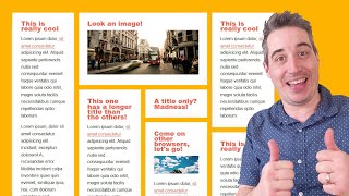
Masonry Layout with CSS Only
Learn to create Masonry layouts using CSS, including basic implementation, spans, align-tracks, and fallback options. Discover techniques for robust designs and stay updated on emerging CSS features.

Container Queries Are Possible
Discover a clever CSS trick to replicate container queries using flex properties, enabling responsive layouts without media queries. Learn to implement this powerful technique for more flexible web design.
Stop Fighting with CSS by Taking Advantage of These Tools
Explore 5 essential CSS devtools in Firefox for efficient debugging and responsive design. Learn to inspect, edit properties, and customize your development environment.
Stop Fighting with CSS Positioning
Understand CSS containing blocks and positioning to improve responsiveness and control layout. Master absolute, sticky, and fixed positioning for effective web design.

How to Create an Expanding Search Bar Using -focus-within
Learn to create an expanding search bar using CSS :focus-within, custom properties, and SCSS, without JavaScript. Explore hover and focus states, backgrounds, and animations for an interactive user experience.

Build a Responsive, Animated Accordion That Looks Pretty Good
Learn to create a visually appealing, responsive accordion with smooth animations. Explore HTML structure, CSS styling, JavaScript interactions, and accessibility considerations for an enhanced user experience.

Mega Drop Down Menu Tutorial - Responsive and Fluid Design
Create a responsive and fluid mega drop down menu inspired by the Boston Globe website, with step-by-step guidance on implementation and best practices.
Design & Build a Website Crash Course - HTML & CSS
Learn to build a responsive website from scratch using HTML and CSS, covering layout, styling, animations, and multi-page design in this comprehensive tutorial.

Build a Responsive Website With HTML & CSS Tutorial
Learn to build a responsive website with HTML and CSS, covering animations, flexbox, and media queries for mobile optimization. Gain practical skills in modern web development.

CSS Grid Tutorial - CSS Grid Crash Course
Comprehensive tutorial on CSS Grid, covering basics to advanced techniques. Learn to structure and position website elements efficiently, including responsive image gallery creation.
An Introduction to CSS Logical Properties
Learn CSS logical properties to create layouts that adapt to different writing directions, covering content direction, text alignment, spacing, dimensions, and positioning.

Editor X - The Most Advanced Visual Website Builder
Explore Editor X's advanced visual website builder, featuring flexbox and grid layouts for responsive design without coding. Learn to create a photography business site while discovering powerful features.

CSS Masterclass - Tutorial and Course for Beginners
Comprehensive CSS tutorial covering basics to advanced concepts, including Flexbox, positioning, responsive design, and TailwindCSS, with practical examples for building professional websites.
Interacting with The Canvas - HTML5 Canvas Tutorial for Beginners
Learn to create interactive HTML5 Canvas animations with mouse events, dynamic circle growth, color randomization, and responsive design techniques for engaging web experiences.

Build a Blog on Linode Using Tailwind CSS - Bootstrap Alternative
Learn to build and deploy a customized blog using Tailwind CSS and Next.js, integrating MongoDB for data management and hosting on Linode. Covers responsive design, database connectivity, and content fetching.
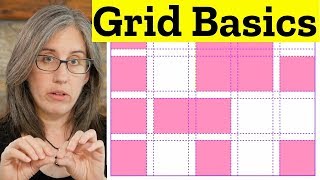
CSS Grid
Master CSS Grid for flexible, responsive layouts. Explore innovative design techniques, practical examples, and common pitfalls to create visually stunning web interfaces.