
Responsive Color in CSS - Techniques and Best Practices
Discover responsive color techniques in CSS, from hex values to media queries. Learn to adjust colors for different devices, contexts, and accessibility needs using Sass preprocessor.
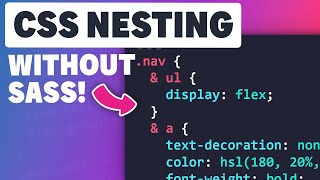
Getting Started with CSS Nesting
Learn CSS nesting: syntax, usage, limitations, and best practices. Explore compound selectors, media queries, specificity, and readability considerations for this powerful new feature.

Create Cross-Platform Apps with Expo - Learn with Jason
Learn to build iOS, Android, and web apps from a single codebase using Expo. Discover cross-platform development techniques, shared components, and efficient app creation with expert guidance.
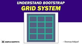
Understanding the Bootstrap Grid System - Part 1
Learn Bootstrap's grid system for responsive web design, including media queries, breakpoints, and container-row-column structure for effective mobile-first layouts.
Container Queries Are Going to Be a Game Changer
Explore the game-changing potential of container queries in CSS, their implementation, and how they revolutionize responsive layout design compared to traditional media queries.
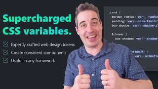
Supercharge Your CSS with Open Props
Explore Open Props to enhance CSS with pre-built custom properties. Learn setup, customization, typography, and responsive design for efficient styling and improved workflow.

Media Queries in CSS - History, Features, and Future
Comprehensive exploration of Media Queries in CSS, covering history, features, APIs, and future developments. Insights on implementation, pitfalls, and emerging trends in responsive design.

Meta Layout: A Closer Look at Media Queries
Exploring media queries for mobile design: syntax, logical expressions, relevant features, and strategies for effective meta-layout implementation in responsive web development.

Media Queries and Container Queries in CSS - A Comprehensive Guide
Explore media and container queries in CSS, learning their differences, use cases, and advanced features like range syntax, container query units, and style queries.
Responsive Layouts Workshop
Master responsive CSS layouts with hands-on practice. Learn techniques for flexible, adaptive designs that work across devices. Enhance your web development skills and create visually appealing, user-friendly websites.
Start Using CSS Grid Layout
Learn to create complex, responsive web layouts using CSS Grid's native system. Explore line-based layouts, flexible grids, and box alignment for modern design implementation.

CSS vs. JavaScript, Trust vs. Control
Exploring CSS evolution, capabilities, and its relationship with JavaScript. Highlights CSS features like flexbox, grid, and custom properties, while discussing the balance between trust and control in web development.

JavaScript Style Sheets
Explore the benefits and challenges of using JavaScript Style Sheets (JSS) for React applications, comparing it to other CSS solutions and discussing its implementation.

The Mind-Blowing Power of Sass 3.3
Explore advanced Sass 3.3 features for enhanced stylesheet authoring, including Chrome integration, mixin optimization, and media query management techniques.

CSS Levels Up
Exploring CSS past, present, and future: Level 4 specifications, new features, and their impact on web development. Covers selectors, media queries, backgrounds, images, and text improvements.

Responsive Typography Techniques
Explore responsive typography techniques for creating flexible, readable text across devices. Learn practical strategies for scaling, adjusting, and optimizing typography in responsive web design.

Styling and Animating Scalable Vector Graphics with CSS
Learn to style and animate SVGs with CSS for high-quality, resolution-independent graphics. Discover techniques for responsiveness, media queries, and overcoming common challenges in SVG implementation.

The Future of CSS
Explore new CSS layout techniques like Flexbox and Grid, and learn about upcoming features in CSS that will revolutionize web design and simplify complex layouts.
Tonight We're Gonna Code Like It's 1999 - Responsive Emails
Learn responsive email design techniques, from planning to implementation, with tips on tables, inline styles, and media queries for modern, compatible emails across devices.

In The Year 2000 - Designing Responsive Emails
Learn responsive email design techniques for 2016, including reusable templates, media queries, CSS prefixes, and client compatibility. Gain practical insights for creating modern, functional emails across devices.

Get Ready for the Future of CSS
Explore cutting-edge CSS features like custom properties, selectors level 4, and new media queries. Learn about in-browser design capabilities including blend modes and clip-path for enhanced web development.