Multi Level Navigation Menu With HTML & CSS Only - Responsive Dropdown Navbar Menu
Learn to create a responsive, accessible multi-level navigation menu using only HTML and CSS. Covers dropdown functionality, mega menu features, and screen reader compatibility.

Tailwind CSS Config and Deploy Tutorial
Learn to configure Tailwind CSS, adjust media queries, extend themes, and deploy your project to GitHub and Render.com in this comprehensive tutorial.
Tailwind CSS Project - TailwindCSS Tutorial
Learn advanced Tailwind CSS techniques to build a responsive website, including custom media queries, pseudo-elements, and various CSS styles for testimonials, contact forms, and footers.
Build a Website with Tailwind CSS - Project Tutorial
Learn to build a responsive website using Tailwind CSS, covering media queries, light/dark mode, and various CSS styles through class names. Hands-on project tutorial for practical implementation.

CSS Full Course for Beginners - Complete All-in-One Tutorial
Comprehensive CSS3 tutorial covering selectors, layout, styling, animations, and more. Ideal for beginners looking to master modern web design techniques through hands-on projects and in-depth instruction.

CSS Complete Project for Beginners
Comprehensive tutorial on modern CSS and responsive web design, covering HTML structure, styling, layout techniques, and advanced features like dark mode for a taco shop website.
CSS Responsive Card Design - Mini-Project Tutorial for Beginners
Learn to create a responsive card design using CSS, covering HTML structure, styling, media queries, and breakpoints for various screen sizes.

Build a Responsive Online Portfolio from Scratch
Learn to create a responsive online portfolio using HTML, CSS, and basic JavaScript. Covers layout, navigation, sections, media queries, and deployment to a custom domain.
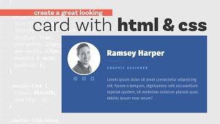
Build a Responsive Card - HTML and CSS Tutorial
Learn to create a fully responsive card using HTML, CSS, and flexbox, mastering essential web design techniques for adaptable layouts.

Simple Tips to Making Responsive Layouts the Easy Way
Learn five easy techniques for creating responsive layouts, including global styling, flexible sizing, media queries, and modern CSS features to enhance your web design skills.
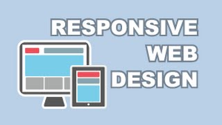
Responsive Web Design Tutorial - Creating Optimized Sites for Multiple Devices
Learn to create websites that adapt seamlessly to any device. Master techniques for optimizing layouts, images, and content for various screen sizes, ensuring a consistent user experience across platforms.

Build a Responsive Website With HTML & CSS Tutorial
Learn to build a responsive website with HTML and CSS, covering animations, flexbox, and media queries for mobile optimization. Gain practical skills in modern web development.

Creating Page Transitions with Barba.js and GSAP
Learn to create seamless page transitions using Barba.js and GSAP. Master techniques for smooth, artsy animations that enhance user experience and elevate your web design skills.
Parallax in HTML, CSS and JavaScript Tutorial - Let's Make It Happen
Learn to create stunning parallax effects using HTML, CSS, and JavaScript with Laxxx.js. Master mobile-friendly designs and explore various parallax techniques for engaging web experiences.
Code a Dark/Light Theme Toggle with JavaScript, CSS, and HTML
Learn to create a dark/light mode toggle using HTML, CSS, and JavaScript. Explore toggle switch coding, theme implementation with CSS variables, and system preference detection via media queries.
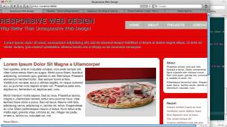
Responsive Web Design - A Visual Guide to Media Queries
Explore media queries for creating adaptable websites across devices, enhancing user experience through flexible layouts and designs.

The Web is Ready for Great Graphic Design - CSS Day 2018
Explore how modern CSS tools enable flexible, high-quality graphic design for the web. Learn practical techniques inspired by iconic print designs, applicable to contemporary projects.

HTML and CSS for Absolute Beginners - 2024 Crash Course
Comprehensive beginner-friendly guide to HTML and CSS, covering layout creation, mobile-first design, JavaScript basics, and responsive web development with hands-on project work.
A Practical Guide to Responsive Web Design
Learn practical tips for creating responsive web designs, including avoiding fixed sizes, leveraging browser capabilities, and using media queries effectively.
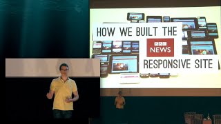
Scale and Adapt - Building Responsive BBC News
Explore BBC News' journey in building a responsive, high-performance website that adapts to diverse devices, focusing on scalability, browser support, and innovative development techniques.

The Mobile Viewports - Understanding Layout, Visual, and Ideal Viewports
Explore mobile viewports, responsive design, and pixel complexities in web development. Gain insights into layout, visual, and ideal viewports, meta viewport settings, and browser quirks.