Responsive HTML CSS Portfolio Website Using Flexbox and Grid
Build a responsive portfolio website using HTML, CSS Flexbox, and Grid. Learn to create and style hero, about, services, portfolio, contact, and footer sections for a professional online presence.

CSS Grid Intro and Basic Layout Tutorial for Beginners
Learn CSS Grid basics and create layouts with properties like grid-template-columns, grid-auto-rows, and grid-template-areas. Hands-on practice building a responsive grid layout for web pages.

CSS Grid Tutorial - CSS Grid Crash Course
Comprehensive tutorial on CSS Grid, covering basics to advanced techniques. Learn to structure and position website elements efficiently, including responsive image gallery creation.

CSS Grid Responsive Image Gallery Tutorial
Learn to create a responsive image gallery using CSS Grid, with animations and mobile optimization. Gain practical skills in modern web design techniques.
CSS Grid Tutorial - Responsive Crash Course
Master CSS Grid for responsive web design: layout techniques, properties, and the fr unit. Build flexible layouts easily with this modern spec.
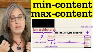
Creating Flexibility Models with CSS Grid
Learn advanced CSS Grid techniques to create flexible layouts, including content sizing, FR units, and MinMax for responsive designs.
CSS Grid
Master CSS Grid for flexible, responsive layouts. Explore innovative design techniques, practical examples, and common pitfalls to create visually stunning web interfaces.
Real Art Direction on the Web
Explore innovative web layout techniques using Flexbox, Grid, Shapes, and more. Learn to create unique designs that leverage graphic design principles for impactful web pages.
Responsive Layout Practice for Beginners - Creating a Four Card Feature Section
Learn responsive layout techniques through a hands-on project, covering HTML structure, CSS styling, custom properties, and mobile optimization for a feature section design.
Simple Approach to Layouts: From Design to Code
Learn a simple approach to transform design layouts into code efficiently. Break down complex designs, organize elements, and choose between flexbox and grid for optimal implementation.

CSS Course for Beginners - Programming Tutorial
Learn CSS fundamentals including selectors, box model, positioning, layout, and responsive design. Master CSS grids, Flexbox, and table styling while creating practical reference tools.
How to Escape the Container on Only One Side
Learn advanced CSS techniques to create full-width elements on one side of a container, exploring custom properties, logical properties, grid, and positioning for versatile and responsive web design.

React Admin Dashboard Tutorial - Responsive React Admin Panel UI Design Course
Learn to build a responsive React admin dashboard with charts, data grids, and CRUD functionality. Master essential UI design techniques and deploy your project.
The Evolution of Responsive Web Design: What's Next?
Explore modern CSS techniques for responsive design, including container queries, style queries, and fluid sizing. Learn to create adaptable websites without heavy reliance on media queries.

Professional Website Creation with HTML and CSS for Beginners
Learn to build a professional website from scratch using HTML, CSS, and JavaScript. Cover responsive design, interactive elements, and deployment to create a fully functional site.
Layouts with CSS Grid
Explore advanced CSS Grid techniques for creating dynamic layouts, including sticky positioning and typography-based designs. Hands-on examples and CodePen challenges included.
Let's Learn CSS Grid
Explore CSS Grid with expert Rachel Andrew to create stunning layouts without complex markup or JavaScript. Learn practical techniques for responsive design and modern web development.

How to Create Website Layouts Using CSS Grid - Learn HTML and CSS - HTML Tutorial
Explore CSS Grid for modern website layouts. Learn to create flexible, responsive designs using columns, rows, and areas. Master grid customization and mobile optimization techniques.
CSS Grids Will Change How We Create Website Layouts - Learn HTML and CSS
Explore CSS grids for modern website layouts. Learn creation, HTML placement, responsiveness, and best practices in this comprehensive guide to revolutionizing web design with grid-based layouts.

Impossible Layouts for CSS to Handle
Explore CSS grid techniques for creating brutalist-style layouts, focusing on row and column structures to achieve unique and challenging designs.
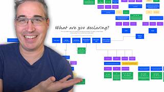
Choosing the Right CSS Unit - A Flowchart Guide
Comprehensive guide to selecting appropriate CSS units, covering positioning, font sizes, spacing, and layout. Includes a practical flowchart and in-depth explanations for various scenarios.