HTML & CSS Full Course - Beginner to Pro
Comprehensive guide to HTML and CSS, covering basics to advanced topics. Learn to create complex websites through hands-on projects and exercises. Ideal for aspiring web developers.
CSS Grid Tutorial
In this tutorial, you will learn about CSS Grid. You will learn about the use of CSS Grid, columns, rows, grid lines, nested grids, aligning and justifying items, creating a 12-column grid, mosaic layout, grid areas, and responsive grid examples.

The Frontend Development Crash Course - Learn HTML & CSS
Learn to build a modern website using HTML and CSS, covering layout techniques, animations, and responsive design principles for creating visually appealing web interfaces.
HTML & CSS for Beginners
Comprehensive guide to modern web development fundamentals, covering HTML and CSS from basics to advanced layouts. Includes hands-on practice and a final project to reinforce learning.

How to Make a Website Using HTML, CSS, Javascript & GSAP - Responsive With Animations
Create a responsive website with HTML, CSS, JavaScript, and GSAP animations. Learn to build various sections, implement a mobile menu, and add dynamic effects for an engaging user experience.
CSS Grid
Master CSS Grid: from fundamentals to advanced techniques. Learn sizing, placement, responsive design, and practical exercises for creating flexible, powerful layouts.
Mobile-First Responsive Build with CSS Grid
In this mini-series, we'll build a responsive website using a mobile-first approach (developing the site for mobiles first and then extending the design to larger screens).

CSS Grid Cards With Animated Hover Effect - HTML-CSS
Learn to create responsive CSS grid cards with animated hover effects using HTML and SCSS. Master mobile-first design, desktop styling, and interactive elements for engaging web layouts.
Building a Footer Using CSS Grid - Build a Responsive Website from Scratch
Learn to build a responsive footer using CSS Grid, including mobile and desktop styles, grid template areas, and hover states for a polished website design.
Responsive 4-Column Layout with CSS Grid - Build a Responsive Website from Scratch
Learn to create a responsive 4-column layout using CSS Grid for a blog articles section. Explore HTML markup, SCSS styling, and responsive design techniques to build an attractive and functional webpage component.

Build a Responsive Website - HTML, CSS Grid, Flexbox & More
Learn to build a responsive website using modern HTML5 and CSS techniques like Grid, Flexbox, and animations. Gain hands-on experience in creating custom layouts, deploying to Netlify, and adding form functionality.

CSS Grid Crash Course 2022
Master CSS Grid fundamentals through hands-on practice. Learn layout techniques, responsiveness, and apply skills in a real-world project to create dynamic and flexible web designs.

Creative Agency Website From Scratch - HTML & CSS
Build a responsive creative agency website from scratch using HTML, CSS, and JavaScript, covering layout techniques, interactivity, and mobile optimization.
CSS Layout - Flexbox & Grid Basics
Learn CSS layout techniques with Flexbox and Grid, covering responsive design, background colors, and content width for modern web development.
CSS Grid Tutorial - Responsive Design Examples
Explore responsive design with CSS Grid through practical examples, from basic layouts to advanced techniques like manual item placement and breakpoint-free responsiveness.
CSS Tutorials for Beginners
Learn essential CSS concepts including positioning, responsive design, Flexbox, Grid, and animations through practical tutorials and hands-on examples.

CSS Layout
Master responsive web design using CSS Grid and Flexbox through hands-on, uncut tutorials. Learn to create dynamic layouts like carousels, dashboards, and scrolling lists.
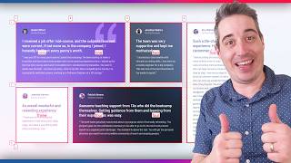
Learn CSS Grid the Easy Way
Simplify CSS Grid with practical tips on layout creation, column spanning, element placement, and responsive design using grid-template-areas and media queries.
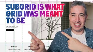
Creating a Robust Grid System Using Subgrid
Learn to build a powerful and flexible grid system using CSS subgrid, enhancing layout control and responsiveness for web designs. Explore advanced techniques for creating custom sections and breaking out of containers.

Creating a Responsive, Asymmetrical Design with HTML & CSS
Learn to create responsive, asymmetrical designs using modern CSS tools like grid, subgrid, flexbox, and clamp(). Master mobile-first approach and adapt layouts for larger screens.

Coding the Front-End of a Signup Form
Learn to create an attractive signup form using CSS Grid, custom properties, and pseudo-elements. Explore layout techniques, styling, and tooltip creation for an enhanced user interface.