Description:
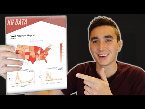
Learn how to generate a professional analytics report in PDF format using Python. Explore the process of creating visually appealing reports by incorporating visualizations from libraries like Matplotlib and Plotly. Discover the power of the fpdf library to package your data and graphs into a polished document. Follow along as the tutorial covers essential topics such as setting up the environment, mastering FPDF basics, choosing paper formats, adding and resizing images, creating helper methods, building multi-page reports, adding titles and letterheads, plotting geographic maps with COVID-19 data, and automating date formatting. Gain practical insights into customizing report aesthetics and finalizing your analytics presentation.
How to Generate an Analytics Report in Python
Add to list