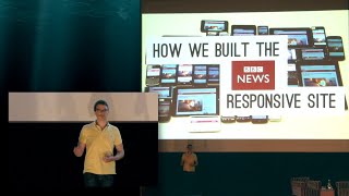
Scale and Adapt - Building Responsive BBC News
Explore BBC News' journey in building a responsive, high-performance website that adapts to diverse devices, focusing on scalability, browser support, and innovative development techniques.

Console Browsers - The Ultimate Torture Test
Exploring console browsers' unique challenges and opportunities, including input methods, screen distances, and emerging trends, to shape future web design and development.

The New Photoshop - Web-Based Mockups for Responsive Design - Part 2
Explore web-based mockups as an effective design tool, addressing client expectations, experimentation, and designing in the browser with practical demos and techniques.

Building for Adaptive Input Experiences - From Mouse to Touch and Beyond
Explore adaptive input experiences across devices, from touch to motion controllers. Learn tips for handling various input types and discover future input possibilities for web development.

Flexbox: Advanced CSS Layout Techniques - CSS Day 2013
Explore flexible box layout techniques with Stephen Hay, covering properties, alignment, and practical applications for responsive web design.

Scrutinizing @font-face - CSS Typography Techniques
Exploring @font-face: from descriptors and substitution to icon fonts and progressive enhancement. Insights on optimizing web typography and cross-browser compatibility.

CSS Day 2014 - Speaker Panel Q&A
Panel discussion featuring eight CSS experts answering audience questions and sharing insights on current trends, challenges, and future developments in CSS technology.

Laziness in the Time of Responsive Design - Simplifying Complex Web Interfaces
Explore responsive design techniques, from fluid grids to animation principles, and learn how to create flexible, immersive interfaces with simpler approaches and less code.

Effortless Style - Simplifying CSS for Content Editors
Explore ways to achieve stylistic nuances in web content without explicit CSS knowledge, focusing on component-based approaches and content editor-friendly methods for effortless styling.

The Mobile Viewports - Understanding Layout, Visual, and Ideal Viewports
Explore mobile viewports, responsive design, and pixel complexities in web development. Gain insights into layout, visual, and ideal viewports, meta viewport settings, and browser quirks.

CSS Grid Layout - Implementing Modern and Responsive Designs
Explore CSS Grid Layout with Rachel Andrew: learn how this native system creates complex, responsive designs without relying on document source order or preprocessors.

Typography on the Web - CSS Day 2015
Explore the evolution of web typography, current browser capabilities, and future innovations. Learn how designers and developers can leverage new features for enhanced typographic control and creativity.

Responsive Color in CSS - Techniques and Best Practices
Discover responsive color techniques in CSS, from hex values to media queries. Learn to adjust colors for different devices, contexts, and accessibility needs using Sass preprocessor.

Enhancing Responsiveness with Flexbox
Enhancing responsive layouts with flexbox: control order, alignment, and proportional sizes while letting the browser handle complex calculations for optimal space utilization.

Responsive Principles - Adapting Web Design for Connected Devices
Explore principles for adaptive web design beyond responsiveness, focusing on creating flexible products for diverse connected devices in an evolving digital landscape.

Pretty, but Not Usable - Bringing User Needs Back into UI Design
Strategies for designers to prioritize user needs while working with imposed frameworks, including collaboration tips and real project examples to improve team processes.
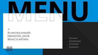
Create a Super Modern Menu Interaction with JavaScript
Learn to create a modern, animated menu navigation using JavaScript and Greensock, covering HTML structure, CSS styling, and interactive animations for a sleek user interface.
For a Future-Friendly Web - Rethinking Digital Experiences
Explore strategies for creating adaptable digital experiences in an ever-evolving technological landscape, focusing on mobile-first approaches and future-proof design principles.
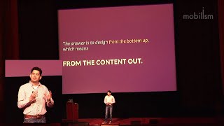
Responsive Design Workflow - Multiplatform Web Approach
Explore a content-based approach to responsive design workflow, focusing on multiplatform realities and practical browser-based design techniques for effective client management and development.
Mobile Apps with JavaScript - Beyond Web Technologies
Explore JavaScript's potential for creating mobile apps with native features, comparing frameworks and showcasing live demos of UI, notifications, and sensors integration.

The Immobile Web - Adapting to Device Diversity Beyond Mobile
Explore the challenges and opportunities of web development for SmartTVs, and how this informs mobile device practices. Insights on device diversity and adapting to larger screens.