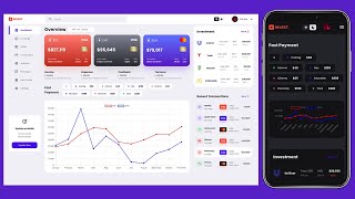
Responsive Admin Dashboard Using HTML, CSS, and JavaScript With Light & Dark Mode
Create a responsive admin dashboard with HTML, CSS, and JavaScript, featuring light and dark modes, modern design elements, and mobile-friendly layout.

Responsive Landing Page Using HTML and CSS - CSS Responsive Design
Create a responsive landing page with HTML and CSS, focusing on navigation and header design. Learn to implement media queries for mobile optimization.

How to Make a Responsive Navbar Dropdown Menu and Website with HTML, CSS, and Vanilla Javascript
Build a responsive website with a dropdown navbar using HTML, CSS, and JavaScript. Learn to create adaptive layouts, animated menus, and interactive elements for all screen sizes.

CSS Tutorial for Absolute Beginners - Learn CSS3
Learn CSS3 fundamentals and responsive web design techniques while building a website. Covers syntax, styling, BEM naming, media queries, and practical tips for beginners.
Build a Responsive Search Bar - HTML & CSS
Learn to create a responsive search bar using HTML and CSS, covering layout techniques, icon integration, and styling for a polished user interface.
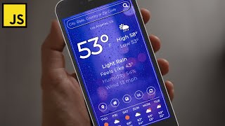
Build a Weather App with Vanilla JavaScript - JavaScript Project for Beginners
Build a responsive weather app using vanilla JavaScript, HTML, and SCSS. Learn API integration, geolocation, data storage, async/await, and serverless functions while prioritizing accessibility.
Animated Hamburger Icon, Mobile Menu & Responsive Navbar with Tailwind CSS
Learn to create an animated hamburger icon and responsive mobile menu using Tailwind CSS, enhancing your web design skills with practical, interactive UI elements.

CSS Complete Project for Beginners
Comprehensive tutorial on modern CSS and responsive web design, covering HTML structure, styling, layout techniques, and advanced features like dark mode for a taco shop website.
CSS Animated Responsive Navbar - CSS Animations for Beginners
Learn to create an animated responsive navbar using CSS transforms, transitions, and animations. Covers pseudo-selectors, menu icon design, and dropdown functionality.
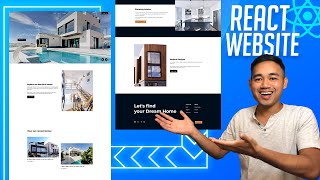
Make a React Website with Animations - Responsive React Project Real Estate Design
Create a responsive React website with animations for a real estate design using hooks, styled components, and React Router. Learn to build a navbar, hero image slider, dropdown menu, and info section.
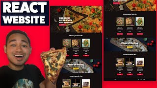
Build a React Website Using Styled Components - Responsive Ecommerce Restaurant Design
Create a responsive React restaurant website with styled components, covering navbar, hero section, sidebar, products, and footer components in a beginner-friendly tutorial.

Build a Responsive Website Using HTML & SASS-SCSS Tutorial
Create a responsive website homepage using HTML and SASS/SCSS. Learn to structure content, style with SASS, and implement a navbar and hero section for an attractive, mobile-friendly design.
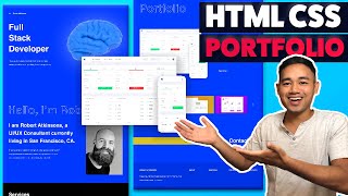
Responsive HTML CSS Portfolio Website Using Flexbox and Grid
Build a responsive portfolio website using HTML, CSS Flexbox, and Grid. Learn to create and style hero, about, services, portfolio, contact, and footer sections for a professional online presence.

HTML CSS Javascript Website Tutorial - Responsive Beginner JS Project with Smooth Scroll
Build a responsive website with HTML, CSS, and JavaScript, featuring smooth scroll and dynamic navbar. Learn step-by-step from setup to advanced features in this comprehensive tutorial.

React Website Using Styled Components - Beginner React JS Project Fully Responsive
Build a responsive React website using Styled Components, React Hooks, and React Router. Learn to create reusable components and implement essential features like navigation, routing, and scrolling effects.
CSS Media Queries and Responsive Web Design Tutorial for Beginners
Learn CSS media queries and responsive web design techniques to create adaptable layouts for different screen sizes. Covers syntax, breakpoints, mobile-first approach, and practical implementation using dev tools.
CSS Background Images and Responsive Image Properties for Beginners
Learn CSS background images and responsive image properties to create visually appealing web designs with properly sized images, effective backgrounds, and standout text content.

Build and Deploy a Responsive Gallery Portfolio Using HTML and CSS
Learn to create and deploy a responsive gallery portfolio using HTML and CSS, with step-by-step guidance on design, styling, and hosting your own professional website.

Build a Better Responsive Admin Dashboard UI - HTML, CSS, JavaScript
Learn to build a responsive admin dashboard UI with collapsible sidebar, icons, and dark mode toggle using HTML, CSS, and JavaScript. Gain practical skills in creating common web interfaces.

Material UI 5 - MUI Responsive Real Project React Tutorial
Learn to build responsive React apps with Material UI 5, covering installation, custom themes, layouts, components, and deployment in this comprehensive tutorial.

SEO Optimized Responsive Portfolio Website Using Next.js
Learn to build a responsive, SEO-optimized portfolio website using Next.js. Master key concepts like data fetching, static paths, and responsive design while creating professional components.