
Designing Grids - Beyond 12 Columns for Modern Web Layouts
Explore advanced grid design theory beyond 12 columns, including uneven columns, compound grids, and modular grids. Learn systematic decision-making for effective layouts in modern web design.
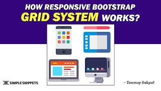
Responsive Working of Bootstrap Grid System - Part 2
Explore Bootstrap's responsive grid system, focusing on device-specific column classes and layout control for optimal mobile-friendly design across various screen sizes.
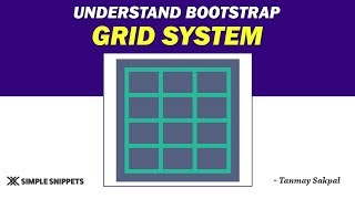
Understanding the Bootstrap Grid System - Part 1
Learn Bootstrap's grid system for responsive web design, including media queries, breakpoints, and container-row-column structure for effective mobile-first layouts.

Bootstrap 5 Tutorial - Crash Course for Beginners
Comprehensive guide to Bootstrap 5, covering key components and features. Learn responsive design, grid system, UI elements, and more in this beginner-friendly tutorial.

How to Make Responsive Website Using HTML, CSS, and Bootstrap - Code & Deploy
Learn to create and deploy a responsive website using HTML, CSS, and Bootstrap. Master modern web development techniques, including navigation, sliders, flexbox, grid, and more.

Transition - CSS Tutorial Series for Beginners
Learn to style websites with CSS, covering colors, formatting, layout, animations, and more in this comprehensive beginner-friendly tutorial series.
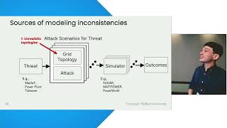
Shedding Light on Inconsistencies in Grid Cybersecurity - Disconnects and Recommendations
Explore inconsistencies in grid cybersecurity, identifying disconnects and offering recommendations for improved protection of critical infrastructure.

Creating a Dashboard with Laravel, Vue, and Pusher
Explore building real-time dashboards using Laravel 5.5, Vue, and Pusher. Learn the entire process, from grid systems to event broadcasting, with practical insights and open-source code examples.
How the Grid Will Be Hacked
Explore vulnerabilities in power grid systems and potential cyber attack scenarios, with insights on protecting critical infrastructure from security experts.
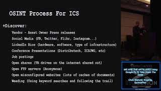
We Are the Artillery - Using Google Fu to Take Down the Grids
Explore advanced Google search techniques to uncover vulnerabilities in critical infrastructure systems, emphasizing responsible disclosure and cybersecurity best practices.