React Native Tutorial for Beginners - Build a React Native App
Learn to build cross-platform mobile apps for iOS and Android using React Native. Covers fundamental concepts, debugging, layouts, and practical exercises for creating functional user interfaces.
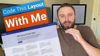
CSS Layout - Flexbox & Grid Basics
Learn CSS layout techniques with Flexbox and Grid, covering responsive design, background colors, and content width for modern web development.
CSS Tutorials for Beginners
Learn essential CSS concepts including positioning, responsive design, Flexbox, Grid, and animations through practical tutorials and hands-on examples.

Quick Tailwind Grids
Learn to create responsive grid systems using Tailwind's utility classes, from basic layouts to advanced techniques like nested grids and auto-generation.

CSS Layout
Master responsive web design using CSS Grid and Flexbox through hands-on, uncut tutorials. Learn to create dynamic layouts like carousels, dashboards, and scrolling lists.

Learn Flexbox the Easy Way
Master flexbox fundamentals through practical examples. Learn key properties like flex-grow, flex-direction, and justify-content. Gain skills to create responsive layouts and solve common flexbox challenges.

Creating a Responsive, Asymmetrical Design with HTML & CSS
Learn to create responsive, asymmetrical designs using modern CSS tools like grid, subgrid, flexbox, and clamp(). Master mobile-first approach and adapt layouts for larger screens.
Create a Responsive Navigation Nav With No JS
Learn to create a responsive navigation menu using modern CSS techniques, including flexbox, grid, and pseudo-elements, without relying on JavaScript for functionality.

Build and Deploy a Fully Responsive Modern UI-UX Website in React JS
Learn to build a responsive React website from Figma design, mastering CSS, animations, and deployment while creating modern UI/UX with reusable components and best practices.
CSS for Non-Web Developers - Tutorial - Part 1
Learn essential CSS properties for non-web developers, covering selectors, colors, layouts, box model, flexbox, and positioning. Master the basics to style your projects effectively.

How to Design a YouTube Clone With HTML-CSS
Learn to clone YouTube's homepage using HTML and CSS, mastering grid, flexbox, and icon integration for improved web design skills.
Mobile First Responsive Contact Form Featuring Grid CSS
Learn to create a responsive, mobile-first contact form using HTML, CSS Grid, and Font Awesome icons, with an entry animation for a polished user interface.
Easy Fullscreen Landing Page With HTML & CSS
Create a simple HTML/CSS landing page with a fullscreen background image using flexbox styling. Learn to build an attractive and responsive web design in just 23 minutes.
Build a Responsive HTML & CSS Template with FlexboxGrid
Create a responsive HTML & CSS template using FlexboxGrid, a lightweight Flexbox-based grid system. Learn to build a modern website layout with easy alignment and Bootstrap-like classes.
Bootstrap Tutorial for Beginners in Hindi - Urdu
व्यापक बूटस्ट्रैप 4 ट्यूटोरियल जो आपको रिस्पॉन्सिव वेबसाइट बनाने के लिए आवश्यक सभी कौशल सिखाता है। ग्रिड सिस्टम, कंपोनेंट्स और प्लगइन्स शामिल हैं।
CSS Advanced Tutorial in Hindi
Comprehensive Hindi tutorial covering advanced CSS techniques, animations, and effects. Includes practical projects and in-depth explanations of key concepts for web developers.

HTML and CSS Tutorial in Hindi
Comprehensive HTML and CSS tutorial in Hindi, covering beginner to advanced concepts with hands-on projects. Learn to design responsive websites from scratch using modern web development techniques.

CSS Tutorial in Hindi
Comprehensive Hindi tutorial covering CSS fundamentals to advanced concepts, including responsive design, animations, and layout techniques for web development beginners.
Tailwind CSS - Curso desde cero Español
Aprende a maquetar y diseñar páginas web responsivas con Tailwind CSS, desde los fundamentos hasta animaciones y efectos, sin necesidad de escribir código CSS.
CSS Tutorial for Beginners in Hindi - Comprehensive Guide
Comprehensive Hindi tutorial covering CSS fundamentals to advanced concepts, including practical projects and in-depth explanations of key properties, layouts, and design techniques.
Build a Website From Scratch - Frontend Mentor EasyBank Landing Page
Learn to create a responsive website with HTML, CSS, and JavaScript, covering navigation, menus, layouts, and more through a step-by-step EasyBank landing page project.