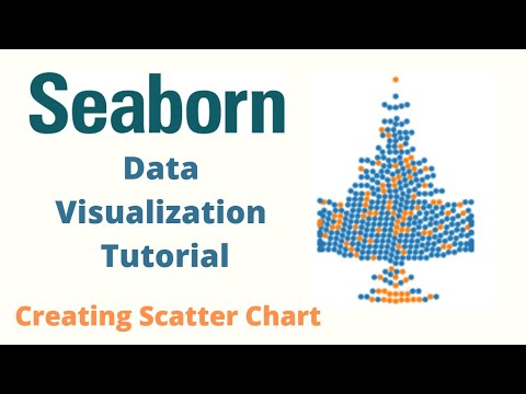
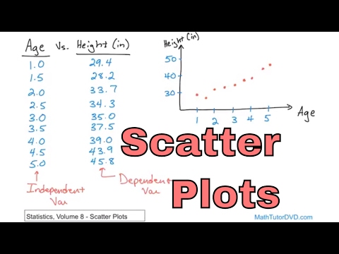
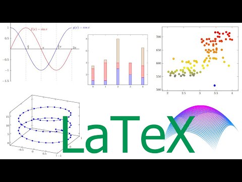
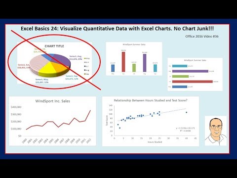
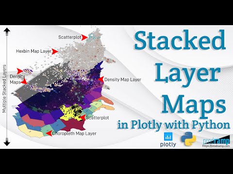
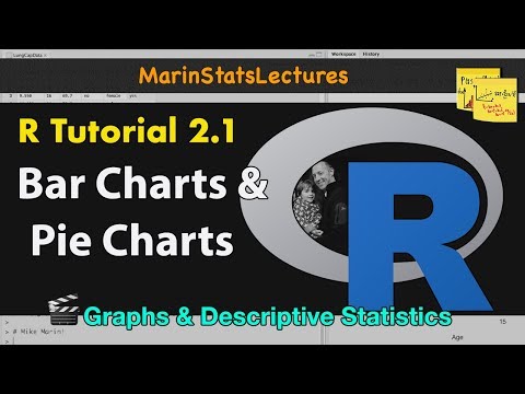
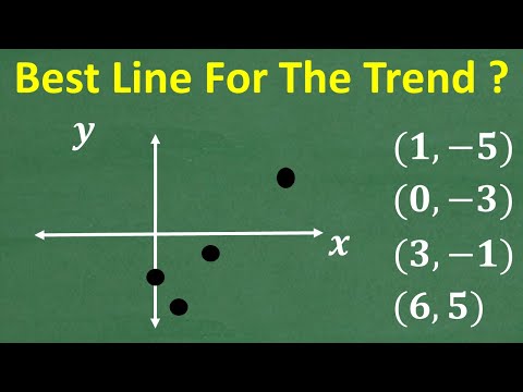
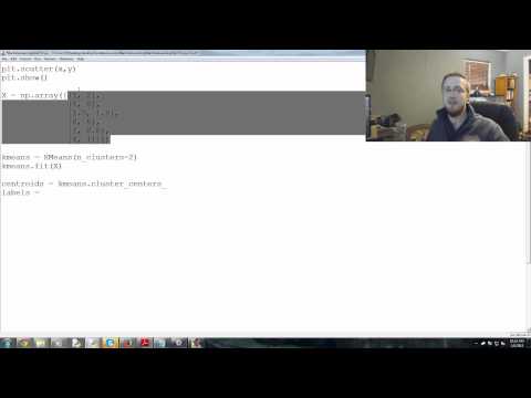
Главная
Study mode:
on
You
History
Saved
In progress
0 courses
compleat
0 courses
#Art & Design
#Adobe
#ChatGPT
#GitHub
#Scatter Plots
Showing:
34
courses
Sort by Relevancy
Highest rated
Lowest rated
Most recently added
Python Seaborn Complete Tutorial for Beginners
0
rewiews
Master data visualization with Python's Seaborn library. Learn to create scatter plots, line charts, box plots, and more through step-by-step tutorials and practical examples.
Add to list
11
Lesons
3 hours 30 minutes
On-Demand
Free-Video
Seaborn Python Tutorial
0
rewiews
Learn data visualization with Seaborn: create scatter plots, line charts, and distribution plots. Master regression models, FacetGrid, and color palettes for effective data analysis and presentation.
Add to list
22
Lesons
2 hours 30 minutes
On-Demand
Free-Video
Connecting Plotly Graphs to Dash Components
0
rewiews
Learn to create interactive data visualizations by connecting Plotly graphs with Dash components. Master various chart types and enhance user interaction in your Python-based dashboards.
Add to list
11
Lesons
4 hours 30 minutes
On-Demand
Free-Video
Data Visualization Using Plotly for Python
0
rewiews
Learn to create interactive and visually appealing data visualizations using Plotly for Python, covering various chart types and techniques for effective data representation.
Add to list
10
Lesons
1 hour 30 minutes
On-Demand
Free-Video
Great Learning
Data Visualization with ggplot2 in R
0
rewiews
ggplot2 is the most popular package for data visualization. It is based on Grammar of Graphics which makes visualization extremely easy.
Add to list
8
Lesons
1 hour 7 minutes
On-Demand
Free-Video
Great Learning
Matplotlib Python Tutorial
0
rewiews
Learn data visualization with Matplotlib in Python. Master various plot types including line, bar, scatter, histogram, and pie charts to effectively represent and analyze data.
Add to list
10
Lesons
49 minutes
On-Demand
Free-Video
Tableau Tutorial
0
rewiews
Learn Tableau's key features, architecture, and data visualization techniques including charts, plots, and KPIs for effective business intelligence analysis.
Add to list
12
Lesons
1 hour 30 minutes
On-Demand
Free-Video
Statistics - Vol 8
0
rewiews
Comprehensive exploration of statistical concepts including scatter plots, correlation, linear regression, and multiple regression, with practical Excel applications and in-depth analysis techniques.
Add to list
33
Lesons
2 hours 30 minutes
On-Demand
Free-Video
Eddie Woo
Bivariate Data Analysis
0
rewiews
Explore scatter plots, correlation coefficients, and lines of best fit to analyze relationships between two variables in this comprehensive introduction to bivariate data analysis.
Add to list
11
Lesons
1 hour 30 minutes
On-Demand
Free-Video
Data Viz Using Plotly for R
0
rewiews
Learn to create interactive data visualizations with Plotly in R, covering various chart types and customization techniques for effective data presentation.
Add to list
8
Lesons
3 hours 30 minutes
On-Demand
Free-Video
Derek Banas
Plotly Tutorial
0
rewiews
Comprehensive tutorial on Plotly for data visualization, covering various chart types, styling options, and advanced features like 3D plots, maps, and animations.
Add to list
27
Lesons
1 hour 23 minutes
On-Demand
Free-Video
Dr Trefor Bazett
How I Make Beautiful Graphs and Plots Using LaTeX
0
rewiews
Learn to create professional-quality graphs and plots using LaTeX and pgfplots, covering 2D and 3D visualizations, customization techniques, and data importing for enhanced scientific and mathematical presentations.
Add to list
15
Lesons
29 minutes
On-Demand
Free-Video
ExcelIsFun
Excel Basics - Excel Charts & Graphs to Visualize Quantitative Data
0
rewiews
Learn to create effective Excel charts and graphs for data visualization, focusing on best practices and avoiding chart junk. Explore various chart types and their applications in data analysis.
Add to list
12
Lesons
35 minutes
On-Demand
Free-Video
Python Seaborn Tutorial in Hindi
0
rewiews
हिंदी में Seaborn डेटा विज़ुअलाइज़ेशन लाइब्रेरी का व्यापक परिचय। लाइन प्लॉट, हिस्टोग्राम, बार प्लॉट, स्कैटर प्लॉट, हीटमैप और पेयरप्लॉट जैसे विभिन्न प्रकार के ग्राफ़ बनाना सीखें।
Add to list
12
Lesons
3 hours 30 minutes
On-Demand
Free-Video
Great Learning
Python for Data Visualization in Hindi - Data Visualization - Python Tutorial
0
rewiews
हिंदी में पायथन का उपयोग करके डेटा विज़ुअलाइज़ेशन सीखें। विभिन्न प्रकार के प्लॉट बनाने के लिए मैटप्लॉटलिब और सीबॉर्न लाइब्रेरी का उपयोग करें, जैसे लाइन, बार, स्कैटर, हिस्टोग्राम और बॉक्स प्लॉट।
Add to list
16
Lesons
1 hour 37 minutes
On-Demand
Free-Video
OSACon
Going Beyond Observability - Grafana for Data Analysis and Visualization
0
rewiews
Discover how Grafana evolves beyond monitoring to become a comprehensive data analysis platform, featuring new visualization tools and enhanced transformation capabilities for diverse analytical needs.
Add to list
1
Lesons
28 minutes
On-Demand
Free-Video
Open Data Science
Follow the Yellow Brick Road - What the Wizard of Oz Can Teach You
0
rewiews
Learn to craft compelling data stories using visualization techniques, design principles, and storytelling methods to effectively communicate insights and engage your audience.
Add to list
41
Lesons
1 hour 28 minutes
On-Demand
Free-Video
Prodramp
Beautiful and Informative Multilayer Stacked Geo Maps in Plotly With Python
0
rewiews
Learn to create multi-layer stacked geo maps in Plotly with Python, combining hexbin, scatter, and density layers for beautiful and informative geospatial data visualizations and dashboards.
Add to list
16
Lesons
20 minutes
On-Demand
Free-Video
Derek Banas
Linear Regressions with StatsModels - Data Science Tutorial
0
rewiews
Learn to create linear regressions using StatsModels, exploring datasets and examples with NumPy, Pandas, Matplotlib, and Seaborn. Analyze professor ratings and tipping strategies through practical applications.
Add to list
7
Lesons
44 minutes
On-Demand
Free-Video
North Carolina School of Science and Mathematics
Nonlinear Data Analysis for Teachers - Professional Development
0
rewiews
Explore nonlinear data analysis techniques for real-world applications, including residual assessment, inverse function linearization, and implementation of CCSS Mathematical Practices with web resources.
Add to list
17
Lesons
1 hour 3 minutes
On-Demand
Free-Video
Bioinformatics With BB
Creating Simple Graphs in R Studio - Bar, Scatter, and Box Plots
0
rewiews
Learn to create bar graphs, scatter plots, pie charts, and box plots using simple R functions for effective data visualization in RStudio.
Add to list
1
Lesons
29 minutes
On-Demand
Free-Video
Learnit Training
Tableau Business Intelligence Master Tutorial - Advanced Dashboard Design and Analytics
0
rewiews
Master Tableau for business intelligence: create interactive dashboards, custom reports, and insightful visualizations. Learn best practices, innovative techniques, and real-world applications to elevate your data analysis skills.
Add to list
22
Lesons
1 hour 29 minutes
On-Demand
Free-Video
Graphs and Descriptive Statistics with R - R Statistical Software Tutorial Videos
0
rewiews
Learn to create various graphs and calculate descriptive statistics using R. Master bar charts, boxplots, histograms, scatterplots, and more while customizing plots and adding text and legends.
Add to list
11
Lesons
1 hour 30 minutes
On-Demand
Free-Video
North Carolina School of Science and Mathematics
Linear Data Analysis for Math Common Core Standards - Part 3
0
rewiews
Explore linear functions for real-world data modeling, focusing on slope and intercept interpretation, linear regression, and residual analysis using interactive tools and practical examples.
Add to list
15
Lesons
45 minutes
On-Demand
Free-Video
TabletClass Math
Learn Scatter Plots and Best Fitting Lines - Algebra, Statistics and Linear Regression
0
rewiews
Master scatter plots and best fitting lines, exploring algebra, statistics, and linear regression concepts for improved data analysis skills.
Add to list
1
Lesons
22 minutes
On-Demand
Free-Video
NPTEL-NOC IITM
Multiple Linear Regression: Model Building and Selection
0
rewiews
Build and select multiple linear regression models through data loading, visualization, and iterative model refinement using R.
Add to list
10
Lesons
15 minutes
On-Demand
Free-Video
sentdex
Unsupervised Machine Learning - Flat Clustering with KMeans with Scikit-Learn and Python
0
rewiews
Explore flat clustering with KMeans using Scikit-learn and Python. Learn to categorize unlabeled data into specified groups through hands-on coding and visualization techniques.
Add to list
9
Lesons
25 minutes
On-Demand
Free-Video
Julia Silge
Hyperparameter Tuning Using Tidymodels
0
rewiews
Explore hyperparameter tuning for random forest models using global food consumption data, enhancing model performance and gaining insights into international dietary patterns.
Add to list
11
Lesons
30 minutes
On-Demand
Free-Video
ChatGPT Code Interpreter vs Tableau - ChatGPT, Tableau GPT & LLMs
0
rewiews
Compara ChatGPT Code Interpreter y Tableau para análisis de datos, explorando capacidades y limitaciones en agregación, visualización y respuesta a preguntas detalladas sobre conjuntos de datos.
Add to list
12
Lesons
25 minutes
On-Demand
Free-Video
sentdex
Generative Python Transformer Model Released - The Off-Brand Github Copilot
0
rewiews
Explore GPyT, an open-source alternative to Github Copilot. Learn how to use this generative Python transformer model for code autocompletion and generation across various programming tasks.
Add to list
14
Lesons
29 minutes
On-Demand
Free-Video
GOTO Conferences
Explorations in Interactive Visual Analytics
0
rewiews
Exploración interactiva de análisis visual de big data, abordando desafíos técnicos y humanos para científicos de datos. Presenta técnicas de visualización, principios de diseño y flujos de trabajo para analizar eficazmente grandes volúmenes de informaci…
Add to list
40
Lesons
46 minutes
On-Demand
Free-Video
linux.conf.au
Election Night Analysis - Art or Science
0
rewiews
Explore statistical methods for predicting Australian election results with ABC analyst Antony Green. Learn about data sources, assumptions, and robust processes used to call elections before official counts are finalized.
Add to list
13
Lesons
33 minutes
On-Demand
Free-Video
Wolfram
Tabular Data Visualization Techniques for n-Dimensional Data
0
rewiews
Explore techniques for visualizing n-dimensional data, including projection and pairwise methods, to effectively convey complex information in 2D or 3D plots.
Add to list
1
Lesons
25 minutes
On-Demand
Free-Video
FUN WITH DATA SCIENCE
Plotly Tips - Exploratory Data Analysis
0
rewiews
Explore data visualization techniques using Plotly library for tips dataset analysis. Learn to create various chart types and gain insights through hands-on exploratory data analysis.
Add to list
9
Lesons
1 hour 30 minutes
On-Demand
Free-Video
load more...