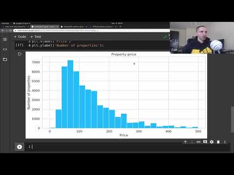
Главная
Study mode:
on
You
History
Saved
In progress
0 courses
compleat
0 courses
#Art & Design
#Adobe
#ChatGPT
#GitHub
#Box Plots
Showing:
19
courses
Sort by Relevancy
Highest rated
Lowest rated
Most recently added
Data Visualization in Python with Plotly
1
rewiews
Learn to create interactive data visualizations using Plotly in Python, including scatter, bar, line, bubble, histogram, and box plots, with customization techniques for effective data presentation.
Add to list
20
Lesons
1 hour 30 minutes
On-Demand
Free-Video
School of Chemoinformatics in Latin America
Integration then Interrogation: Exploratory Data Analysis on a Deadline - 2022
0
rewiews
Explore strategies for efficient exploratory data analysis, focusing on visualization techniques, predictive modeling, and practical constraints in chemical biology datasets.
Add to list
22
Lesons
39 minutes
On-Demand
Free-Video
Python Seaborn Complete Tutorial for Beginners
0
rewiews
Master data visualization with Python's Seaborn library. Learn to create scatter plots, line charts, box plots, and more through step-by-step tutorials and practical examples.
Add to list
11
Lesons
3 hours 30 minutes
On-Demand
Free-Video
Intro to Seaborn
0
rewiews
Comprehensive video series on Seaborn data visualization library, covering various plot types, styling options, and advanced features for effective data representation in Python.
Add to list
25
Lesons
5 hours
On-Demand
Free-Video
Seaborn Python Tutorial
0
rewiews
Learn data visualization with Seaborn: create scatter plots, line charts, and distribution plots. Master regression models, FacetGrid, and color palettes for effective data analysis and presentation.
Add to list
22
Lesons
2 hours 30 minutes
On-Demand
Free-Video
Data Visualization Using Plotly for Python
0
rewiews
Learn to create interactive and visually appealing data visualizations using Plotly for Python, covering various chart types and techniques for effective data representation.
Add to list
10
Lesons
1 hour 30 minutes
On-Demand
Free-Video
Great Learning
Data Visualization with ggplot2 in R
0
rewiews
ggplot2 is the most popular package for data visualization. It is based on Grammar of Graphics which makes visualization extremely easy.
Add to list
8
Lesons
1 hour 7 minutes
On-Demand
Free-Video
Great Learning
Data Visualization Using Python in Seaborn
0
rewiews
Learn to create statistical graphics in Python using Seaborn. Master line plots, bar plots, scatterplots, histograms, joint plots, and box plots for effective data visualization and analysis.
Add to list
7
Lesons
41 minutes
On-Demand
Free-Video
Great Learning
Matplotlib Python Tutorial
0
rewiews
Learn data visualization with Matplotlib in Python. Master various plot types including line, bar, scatter, histogram, and pie charts to effectively represent and analyze data.
Add to list
10
Lesons
49 minutes
On-Demand
Free-Video
Data Viz Using Plotly for R
0
rewiews
Learn to create interactive data visualizations with Plotly in R, covering various chart types and customization techniques for effective data presentation.
Add to list
8
Lesons
3 hours 30 minutes
On-Demand
Free-Video
Great Learning
Python for Data Visualization in Hindi - Data Visualization - Python Tutorial
0
rewiews
हिंदी में पायथन का उपयोग करके डेटा विज़ुअलाइज़ेशन सीखें। विभिन्न प्रकार के प्लॉट बनाने के लिए मैटप्लॉटलिब और सीबॉर्न लाइब्रेरी का उपयोग करें, जैसे लाइन, बार, स्कैटर, हिस्टोग्राम और बॉक्स प्लॉट।
Add to list
16
Lesons
1 hour 37 minutes
On-Demand
Free-Video
Great Learning
IPL Data Analysis Using EDA - Exploratory Data Analysis Case Study
0
rewiews
Practical guide to IPL data analysis using Python, covering EDA techniques, data preprocessing, and visualization to extract insights from real-world cricket datasets.
Add to list
20
Lesons
1 hour 6 minutes
On-Demand
Free-Video
Bioinformatics With BB
Creating Simple Graphs in R Studio - Bar, Scatter, and Box Plots
0
rewiews
Learn to create bar graphs, scatter plots, pie charts, and box plots using simple R functions for effective data visualization in RStudio.
Add to list
1
Lesons
29 minutes
On-Demand
Free-Video
Descriptive Statistics Concept and With R
0
rewiews
Learn descriptive statistics techniques and their implementation in R, covering data summarization, visualization, and basic measures to effectively analyze and present research findings.
Add to list
13
Lesons
1 hour 30 minutes
On-Demand
Free-Video
Venelin Valkov
Data Visualization Tutorial for Beginners with Matplotlib in Python - Exploratory Data Analysis
0
rewiews
Explore fundamental data visualization techniques using Matplotlib and Seaborn in Python. Learn to create histograms, box plots, violin plots, bar charts, line charts, scatter plots, and more for effective exploratory data analysis.
Add to list
10
Lesons
32 minutes
On-Demand
Free-Video
Julia Silge
Predict Giant Pumpkin Weights With Tidymodels Workflowsets
0
rewiews
Learn to predict giant pumpkin weights using tidymodels workflowsets. Explore data visualization, modeling techniques, and parallel processing for efficient analysis of #TidyTuesday pumpkin competition data.
Add to list
11
Lesons
37 minutes
On-Demand
Free-Video
LiquidBrain Bioinformatics
How to Use Ggplot2 in R - A Beginner's RStudio Tutorial
0
rewiews
Learn to create data visualizations in R using ggplot2, from basic plots to advanced techniques. Covers installation, data understanding, and various plot types for effective data representation.
Add to list
14
Lesons
44 minutes
On-Demand
Free-Video
Detecting DNS Anomalies with Statistics
0
rewiews
Explore statistical methods for detecting DNS anomalies, including letter analysis, unique queries, and outlier identification. Learn practical tools and techniques for enhancing network security.
Add to list
26
Lesons
47 minutes
On-Demand
Free-Video
FUN WITH DATA SCIENCE
Plotly Tips - Exploratory Data Analysis
0
rewiews
Explore data visualization techniques using Plotly library for tips dataset analysis. Learn to create various chart types and gain insights through hands-on exploratory data analysis.
Add to list
9
Lesons
1 hour 30 minutes
On-Demand
Free-Video
load more...