Description:
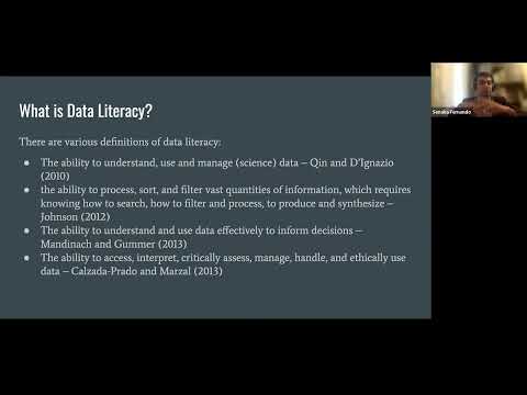
Explore the critical role of data visualization designers in enhancing data literacy during this VizTIG seminar. Delve into the complexities of creating effective data visualizations, drawing from experiences at the Imperial College London's data observatory. Learn about key aspects such as simplicity, interactivity, accuracy, and clarity, while considering aesthetics and visual appeal. Examine real-world examples, including the London Underground map, to understand how visualizations impact data comprehension. Address challenges in data literacy, including colorblind awareness and misleading statistics. Discover industry expectations, data storytelling techniques, and the importance of consistency in design. Gain insights into immersive environments, EEG applications, and space-related visualizations. Understand the five key aspects of effective data visualization and explore various tools and techniques used in the field.
Data Literacy and the Role of the Visualization Designer
Add to list