- Does increasing the space make it more interesting and dynamic contrast?
4
- Group things by aligning them to an axis/how to make a focal point/order
5
- Pushing the letters off the edges
6
- What are rivers in typography
7
- Figure out what’s important
8
- 3rd critique - Imagine it’s the layout of a room/a floor plan. Don’t push everything to the edge
9
- 4th Critique - break things up into groups
10
- Explore different sizes and weights, but only one size and weight per layout
11
- The default font and point size is the worst. The difference changing the point size can make
12
- Make some ugly layouts to discover more
13
- Pushing things to the edge
14
- The 1/3 rule
15
- How to critique your own layout
16
- What are grids? What are they used for in typography?
17
- Upper lowercase is easier to read
18
- if the primary goal of a piece is to communicate in a logical manner, then should the focal point usually be the (in this case) RZN8? Since that's typically what we want people to ID first
19
- How to create separation between two groups that are in all caps
20
- Grids - Fibonacci sequence ***
21
- Double spacing
22
- Be really aligned or really offset
23
- How you should view the design as a floor plan***
24
- How grouping creates the better relationship
25
- Recap
26
- Architecture plug in from Hot Door CAD Tools
Description:
Dive into a comprehensive typography critique session focusing on designing with limitations using one weight and one point size. Learn essential typography skills as professional designers review user-submitted work from a typography class. Explore key concepts such as creating hierarchy, grouping elements, using grids, and understanding focal points. Discover techniques for critiquing your own layouts, the importance of alignment and offset, and how to view designs as floor plans. Gain insights on topics like the top elements of good typography, the impact of spacing, and the effective use of uppercase and lowercase letters. Apply these principles to create more dynamic and visually appealing typographic designs.
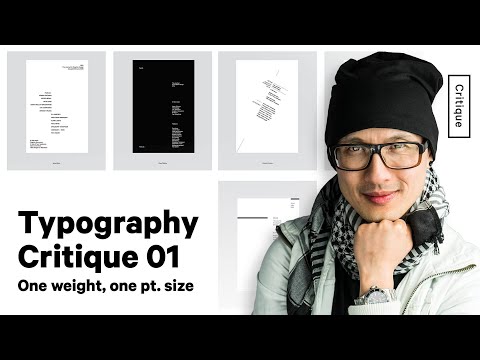
Typography Critique Week 1 - One Weight, One Pt. Size - Designing with Limitations