Description:
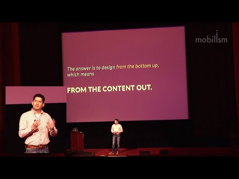
Explore a content-based approach to responsive design workflow in this conference talk from Mobilism 2012. Learn how to adapt to the multiplatform reality of web design, moving beyond fixed-width Photoshop comps and overproduced wireframes. Discover practical techniques for designing in the browser, managing client expectations, and meeting development requirements. Gain insights into content inventory, zero interface, breakpoints, and tools like Dexy, Frames, and PhantomJS. Improve your design process to create more effective, flexible websites across multiple platforms.
Responsive Design Workflow - Multiplatform Web Approach
Add to list
#Programming
#Web Development
#Web Design
#Responsive Design
#Business
#Marketing
#Digital Marketing
#Content Strategy
#User Experience Design
#User Interface Design