Description:
Learn how to create a responsive HTML table in this 27-minute tutorial video. Explore techniques for making tables mobile-friendly while maintaining semantic structure and accessibility. Discover CSS styling methods to enhance table appearance, implement simple and robust responsive designs, and utilize grid layouts for improved cell formatting. Follow step-by-step guidance on setting up the table, applying basic and advanced CSS styles, and addressing accessibility concerns for small screen sizes. Gain insights from expert resources and practical examples to master the art of creating flexible, user-friendly HTML tables for various devices and screen sizes.
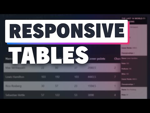
How to Create a Responsive HTML Table
Add to list
#Programming
#Web Development
#HTML & CSS
#Computer Science
#HTML
#Web Accessibility
#Web Design
#Responsive Web Design