Description:
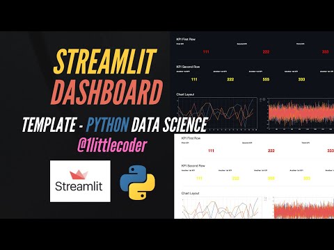
Learn how to build a Streamlit dashboard template for Python data science applications in this 22-minute video tutorial. Explore the process of creating a Tableau-like alternative using Python and Streamlit. Begin by setting up KPI and chart layouts, then add a favicon and create section dividers. Fill in each designed layout section with actual data and charts. Discover how to import Streamlit, use beta columns, implement unsafe HTML, and utilize f-strings. Create line separators and multiple rows for your dashboard. Dive into chart creation and learn how to add a custom page icon. Follow along with a live code demonstration and access the provided Streamlit dashboard template code to jumpstart your project. Gain valuable insights into Streamlit's documentation for further exploration and development of your data science web applications.
Build Streamlit Dashboard Template for Python Data Science
Add to list
#Programming
#Programming Languages
#Python
#Streamlit
#Data Science
#Data Visualization
#Business
#Strategic Management
#KPIs (Key Performance Indicators)
#Web Development
#HTML