Description:
Learn how to utilize the Bootstrap grid system for creating responsive web layouts in this 22-minute tutorial. Explore the fundamental components of the grid system, including containers, rows, and columns. Understand the five breakpoints for different device sizes and how media queries enable responsive design. Dive into practical examples of HTML code to implement the grid structure effectively. Master techniques for controlling responsive behavior across various screen sizes, from extra small devices to large desktops. Gain essential skills for developing mobile-friendly websites using Bootstrap's powerful grid framework.
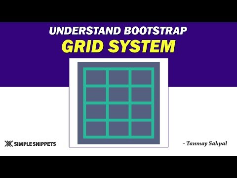
Understanding the Bootstrap Grid System - Part 1
Add to list
#Programming
#Web Development
#HTML & CSS
#Bootstrap
#HTML
#Web Design
#Responsive Web Design
#Computer Science
#Media Queries
#Grid Systems