Description:
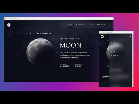
Learn how to create a responsive navbar using HTML, CSS, and JavaScript in this comprehensive tutorial. Explore techniques for styling, implementing mobile-friendly designs, and adding interactive functionality. Discover how to use flex utility classes, create blurry background effects, handle browser support for backdrop-filter, and modify spacing with gap. Master the process of adding and styling a menu button, implementing open/close functionality, and adapting the navigation for larger screen sizes. Gain valuable insights into modern web development practices and enhance your frontend skills through practical examples and step-by-step guidance.

Responsive Navbar Tutorial Using HTML, CSS & JS
Add to list
#Programming
#Web Development
#HTML & CSS
#Computer Science
#Mobile Development
#Programming Languages
#Javascript
#HTML
#Web Design
#Responsive Web Design
0:00 / 0:00