Description:
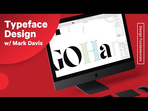
Dive into a comprehensive 88-minute video lecture on typeface design and font creation with Brooklyn-based graphic designer and typographer Mark Davis. Explore the art and process of crafting original typefaces, from historical design methods to modern techniques. Learn about Mark's obsession with fonts, his unique perspective on type, and his preferences for specific font cuts. Discover practical tips for designing wordmarks, working with clients, and analyzing typeface characteristics. Gain insights into the nuances of letter design, including rules for creating the perfect "O" and determining proper overshoots. Understand what makes a typeface truly exceptional and learn about the business side of font design, including pricing for revisions and exclusivity.

Typeface Design and Font Making Process with Mark Davis
Add to list
#Art & Design
#Design & Creativity
#Graphic Design
#Typography
#Business
#Strategic Management
#Pricing Strategy
0:00 / 0:00